




Motion
Everything I make moves.
Freed.ai — animated ads and spot illustration
I’m a brand and motion designer, currently at Stack Overflow. I’m candid about what works, and I build systems that let good work scale.
Chicago
Working in good company
Brand Manager
Senior Brand Designer, 2024–2026
Brand Designer, 2022–2024
Led a rebrand and identity evolution with agency Koto, from first workshops to full rollout, now running the brand across product and marketing.
Freelance Designer
Animations, ads, product mocks, and spot illustrations for an AI scribe that lets clinicians focus on patients.
Graphic Designer
Matured a modern manufacturing brand into a scalable system across product, marketing, and web, as a team of one.
Everything I make moves.
Freed.ai — animated ads and spot illustration
One system, everywhere the brand lives.
Tulip — brand refresh, guidelines, and internal tooling
Strategy, from the first workshop on.
Stack Overflow — the rebrand, below ↓
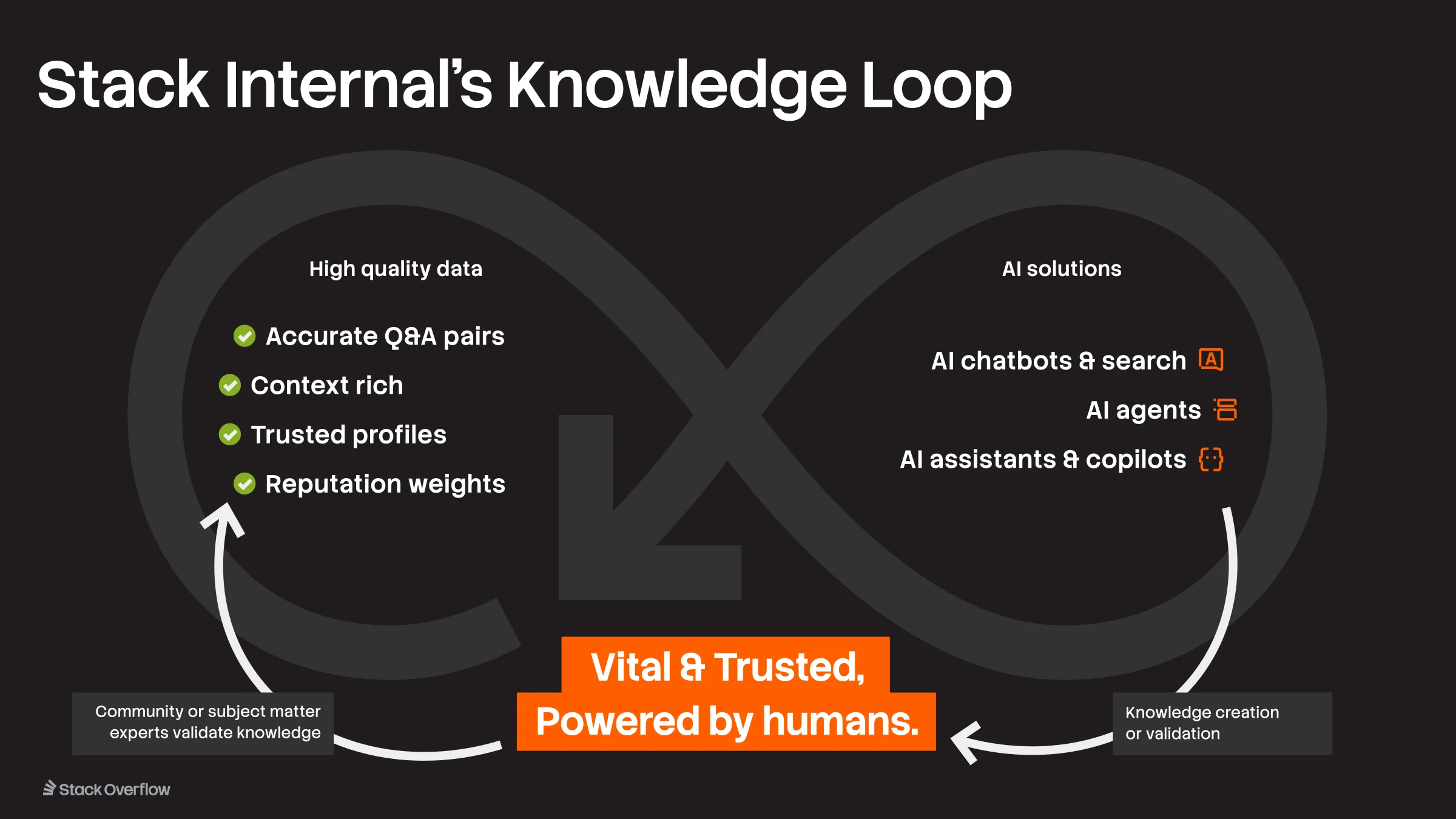
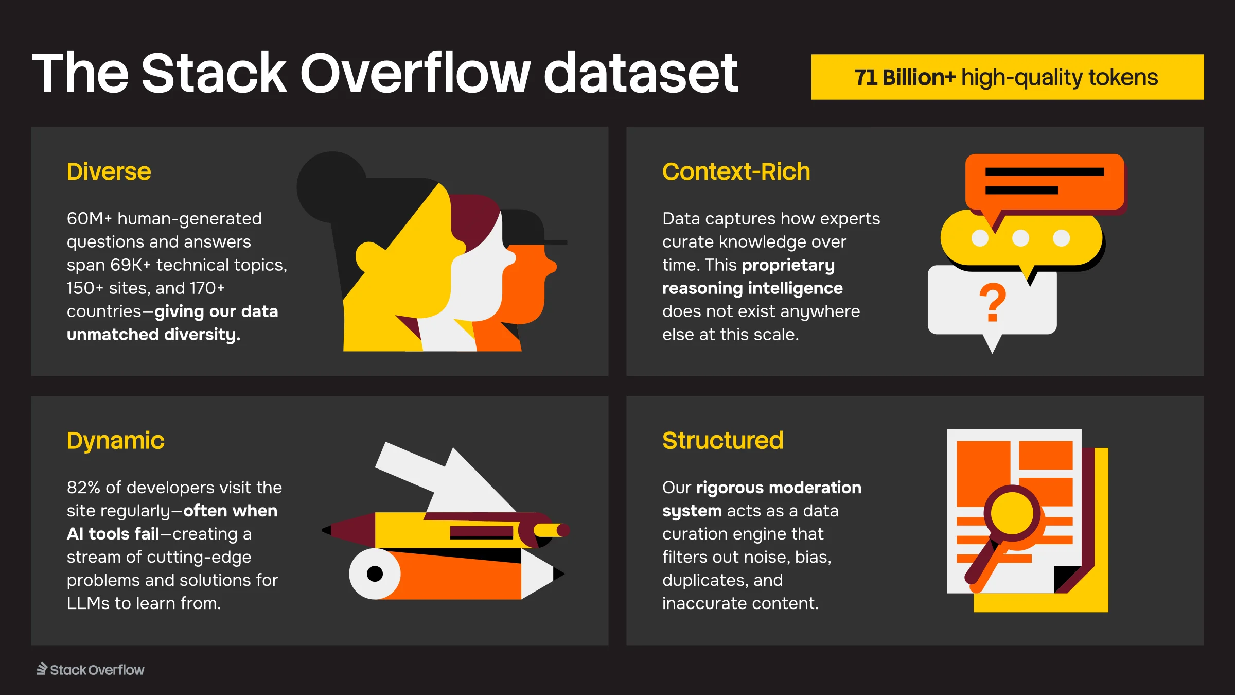
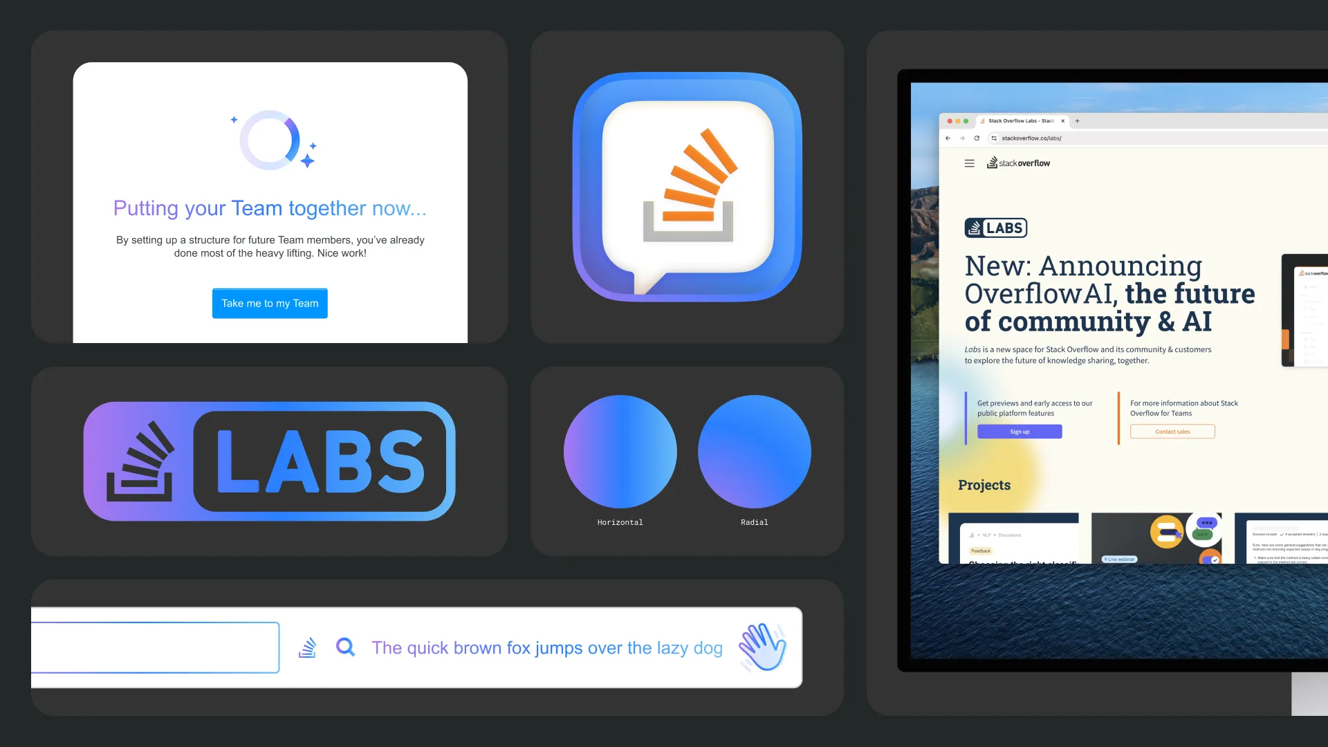
Fifteen years in, with AI upending how developers work, Stack Overflow needed more than a refresh. We rebuilt it for where Stack was headed: verified knowledge that people and AI agents both build on.
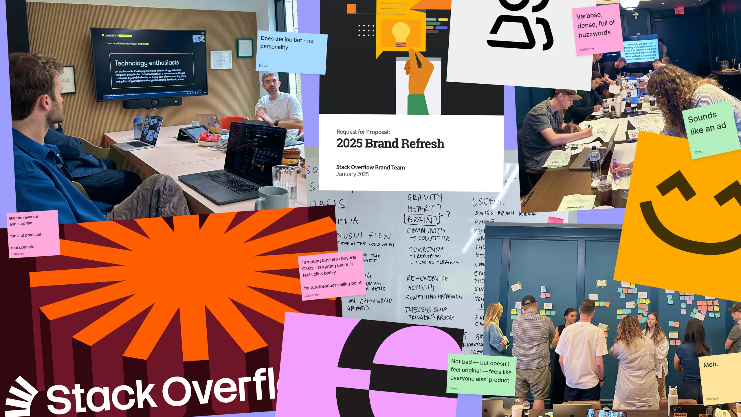
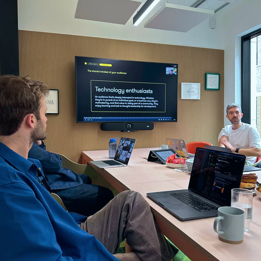
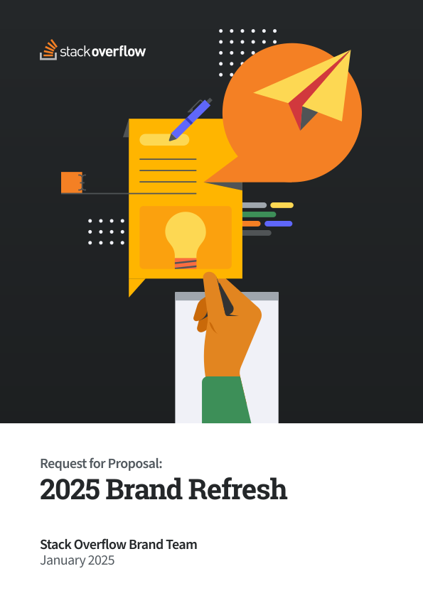
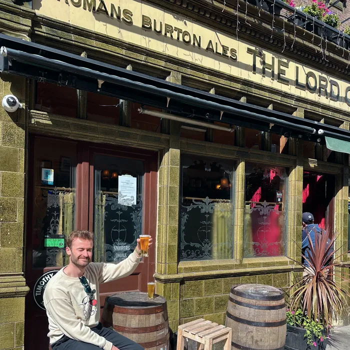
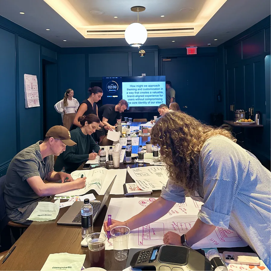
What began as a what-if in a sync with my boss, Dave, snowballed into three months of internal research, a 40-page RFP, and finally a four-agency bake-off that ended with Koto. Internal workshops mapped our what, how, and why long before Koto ever saw the brief, then weeks of work in London with their team expanded that into strategy and tone-of-voice sessions face to face with the C-suite. We left that week with every leader aligned on the same direction, months before any visual work began.
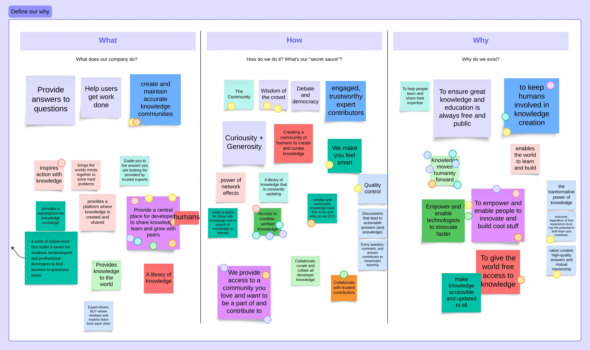
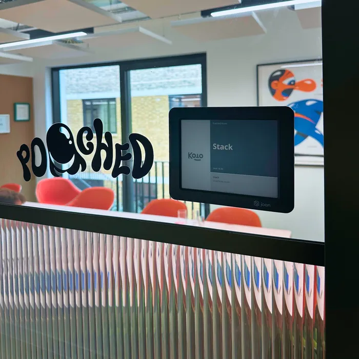
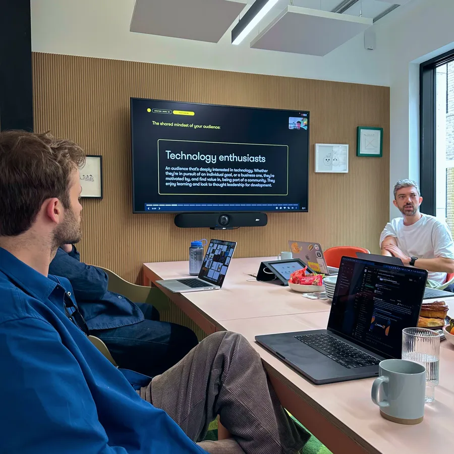
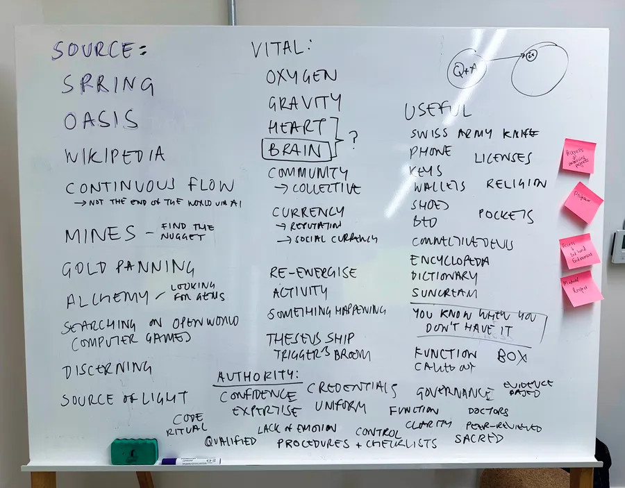
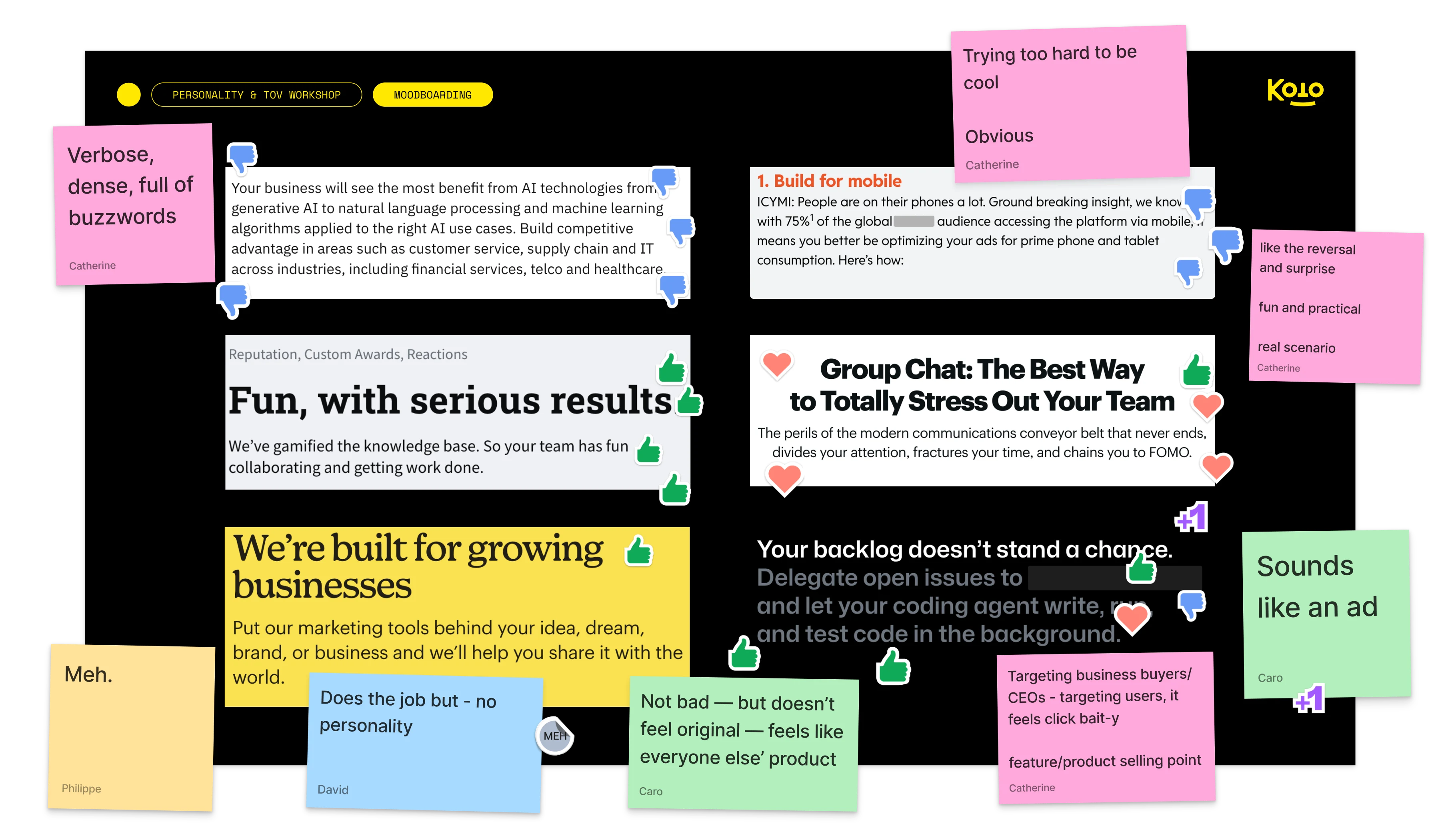
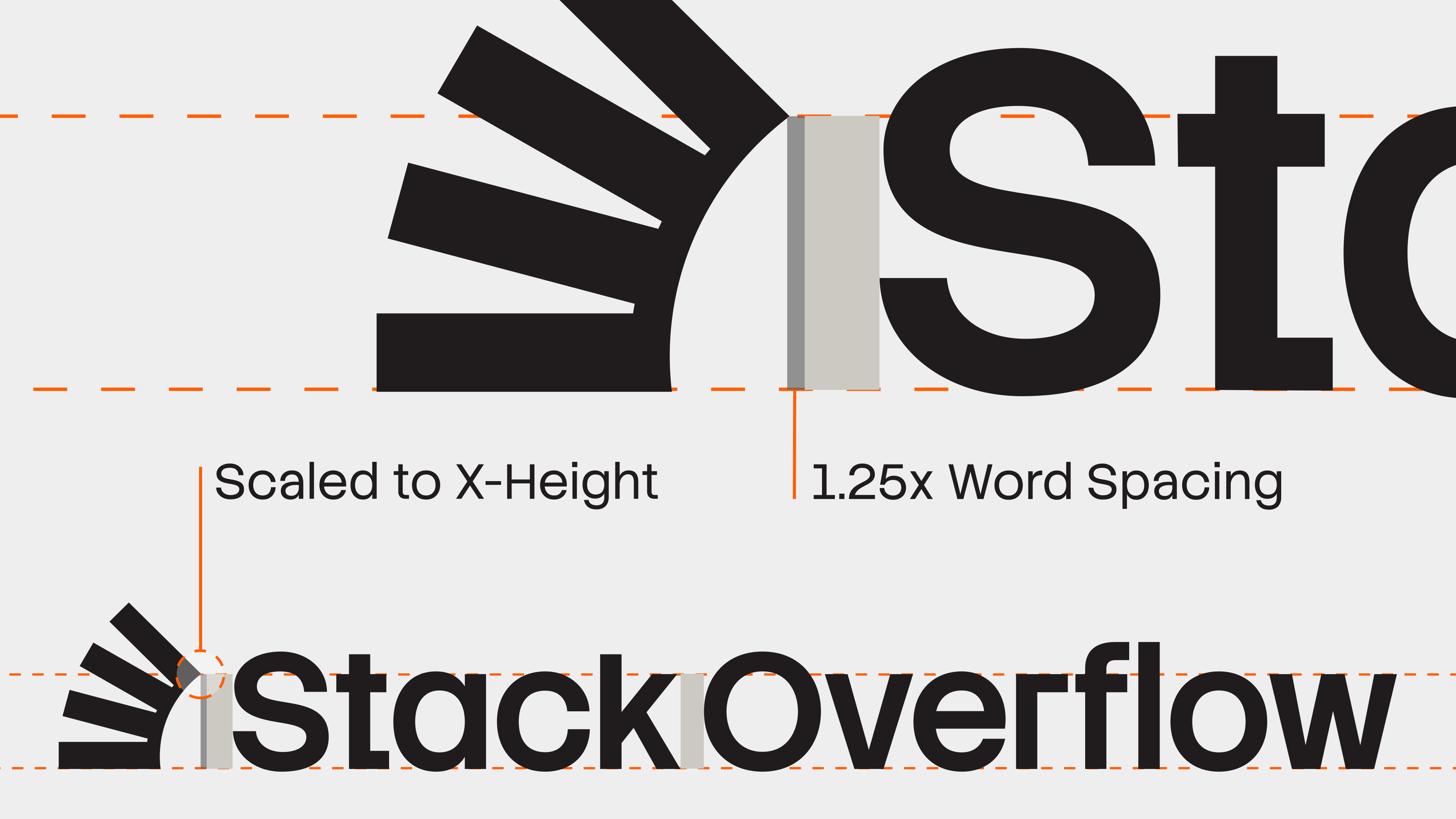
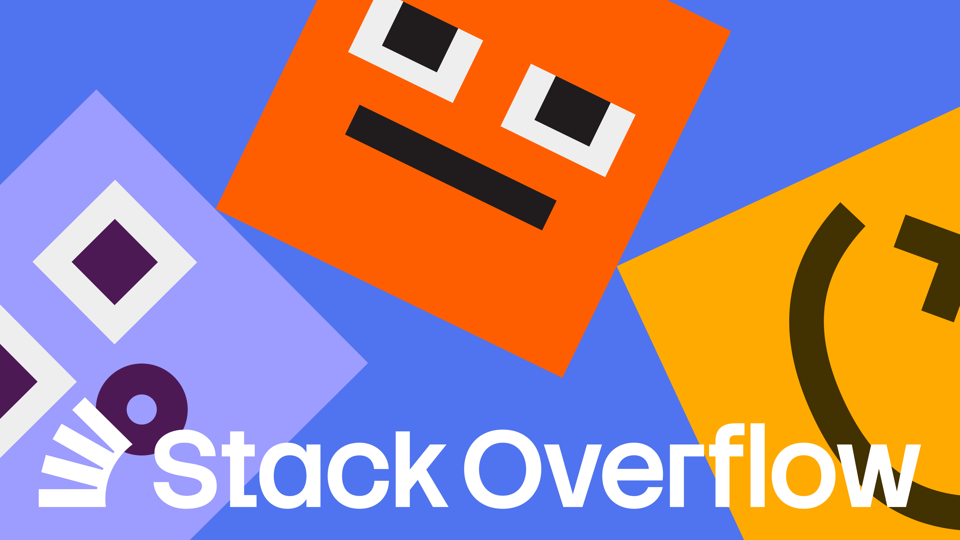
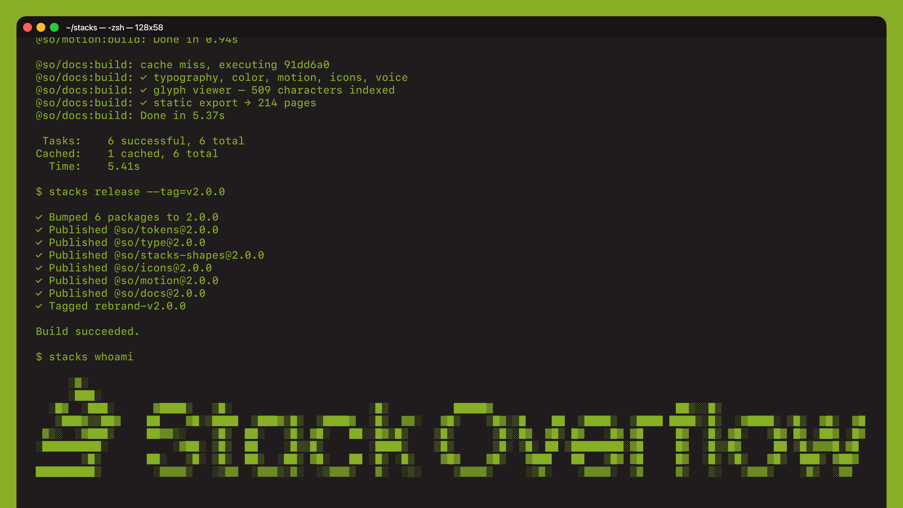
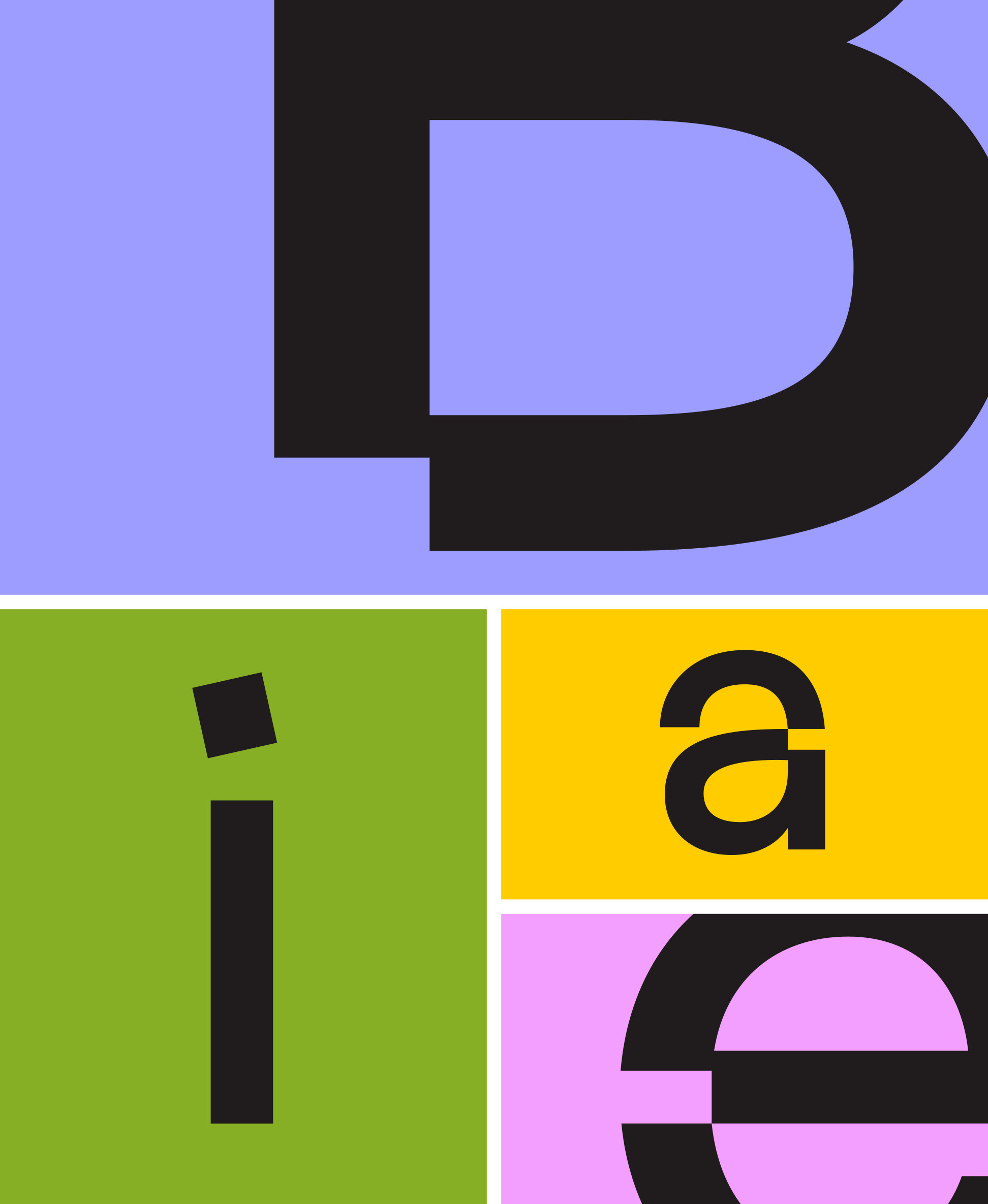
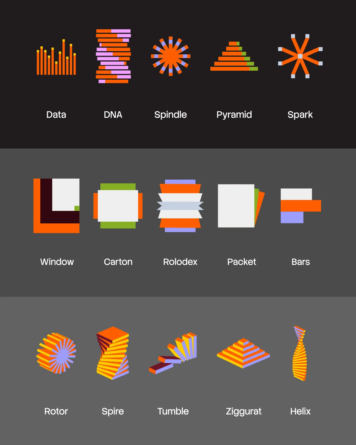
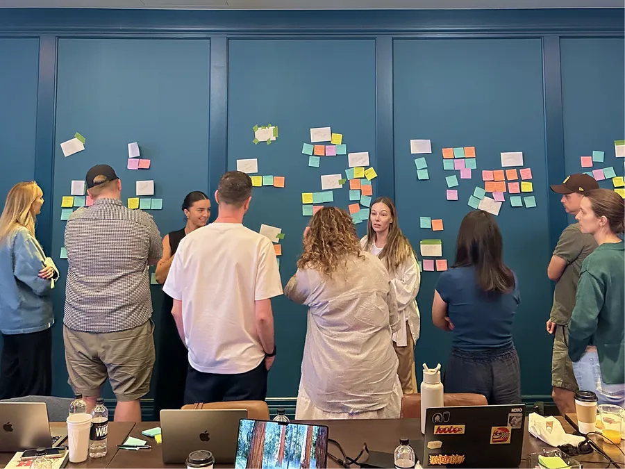
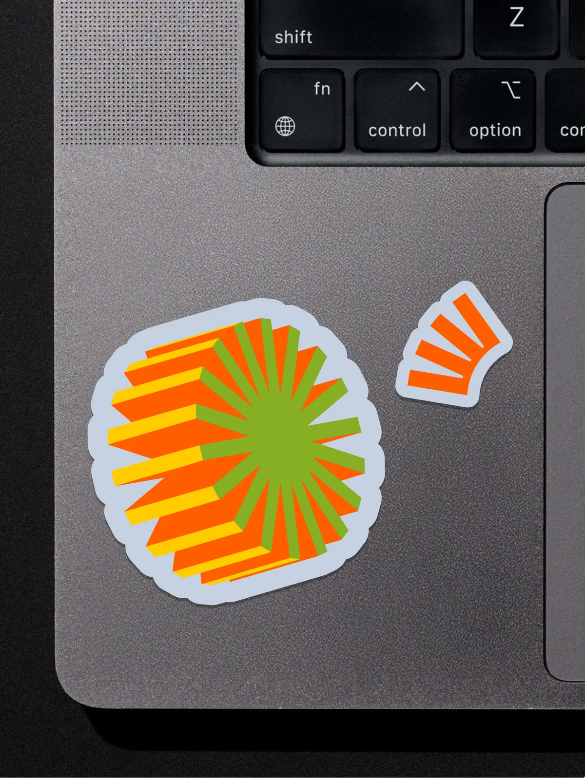
With the direction phase complete, we really got to work. Logo, type, a brand shape system, tone of voice, and more all came together on a guidelines site our team built end to end. We met with Koto and Stack Overflow’s product team in Nashville for a brand-product intensive, sticky notes covering the walls, as we stress-tested the new brand against real interface problems. We left Nashville with a system ready for rollout to both product and marketing.
2/0032

01 / 20Stack Overflow Business Template
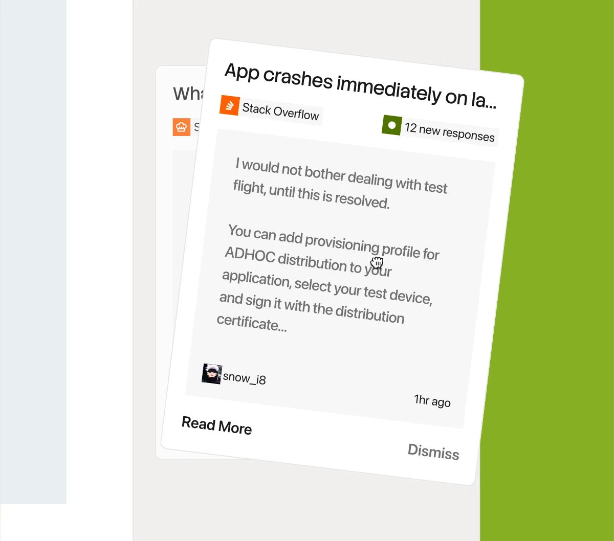
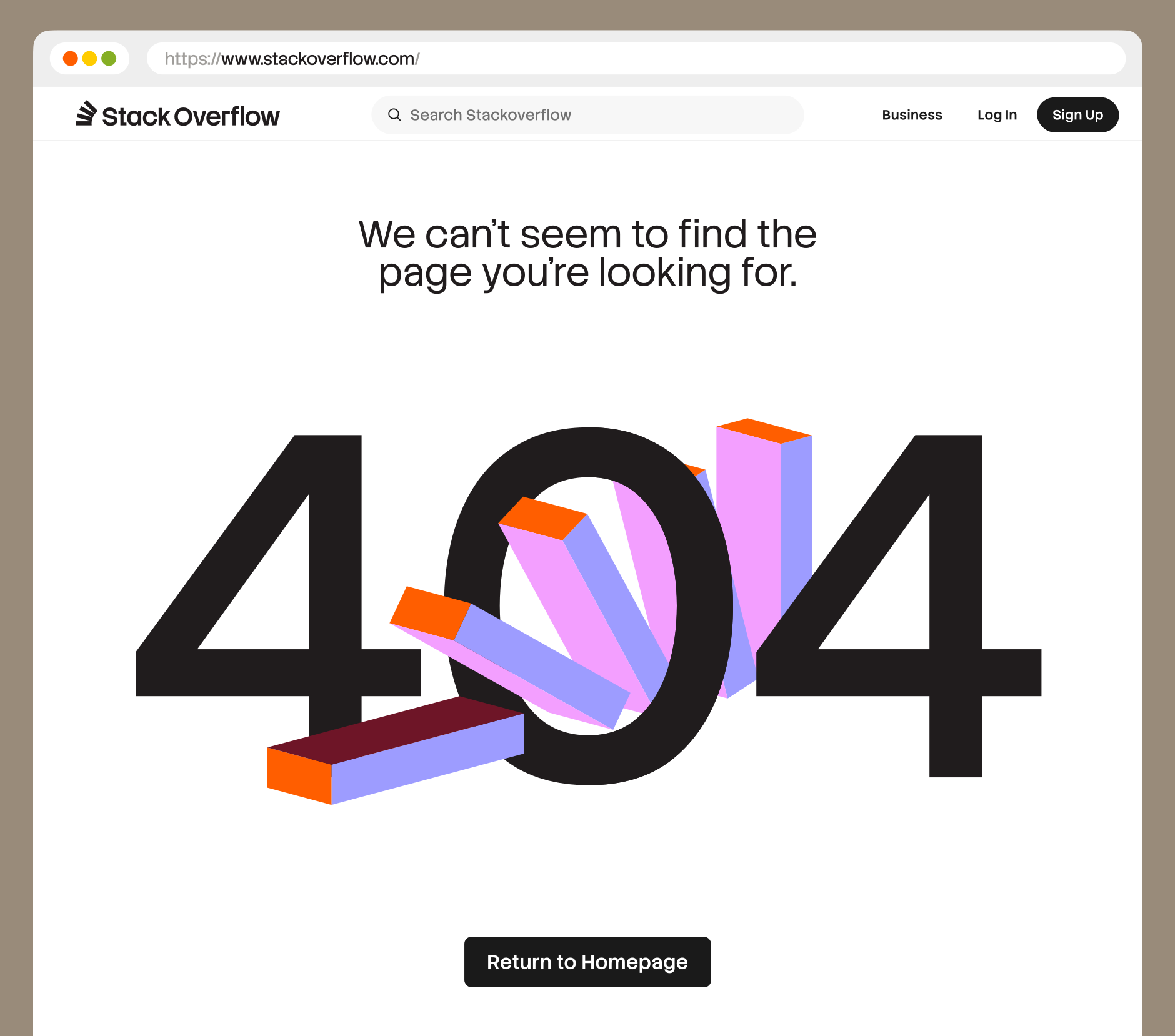
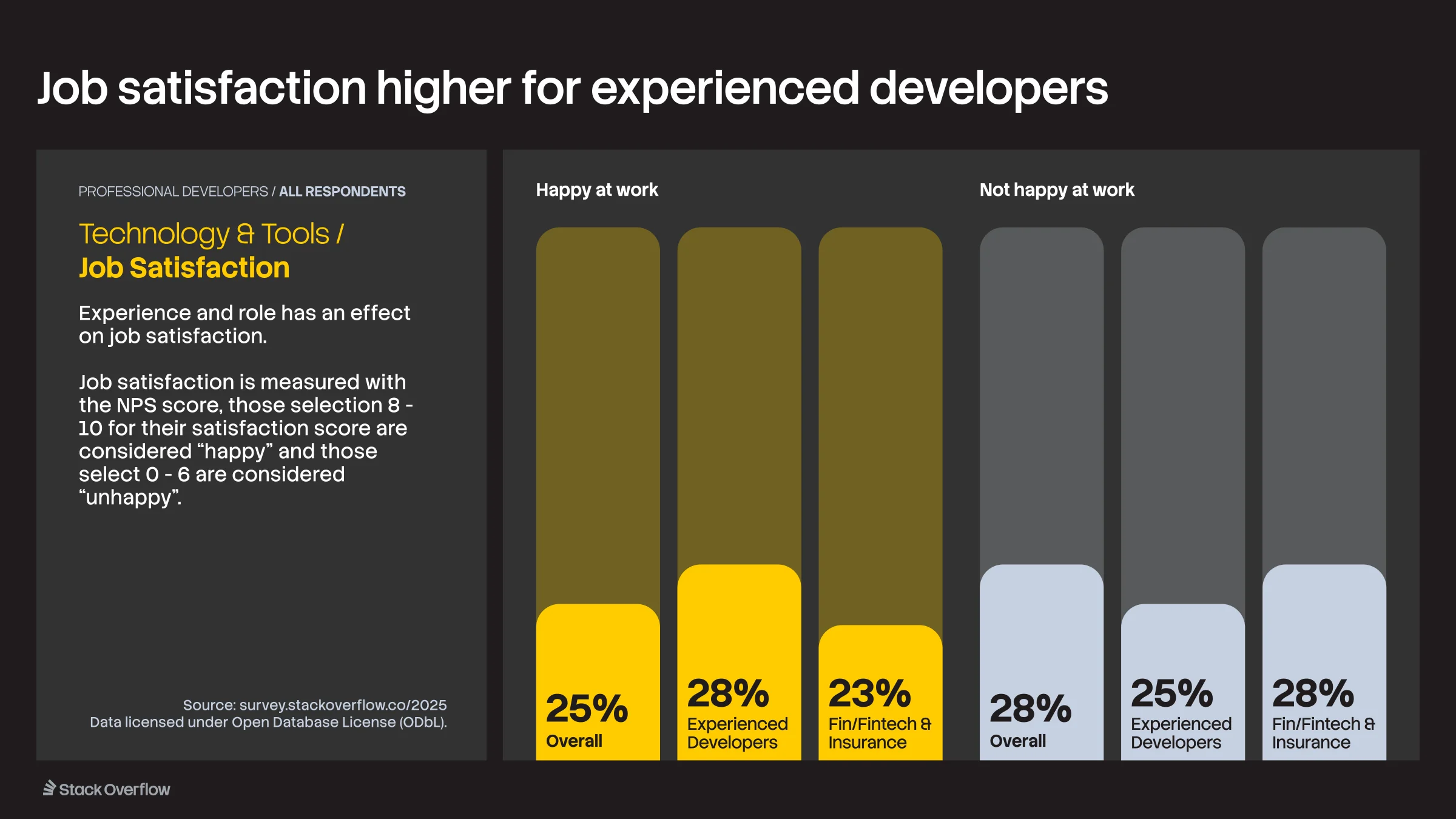
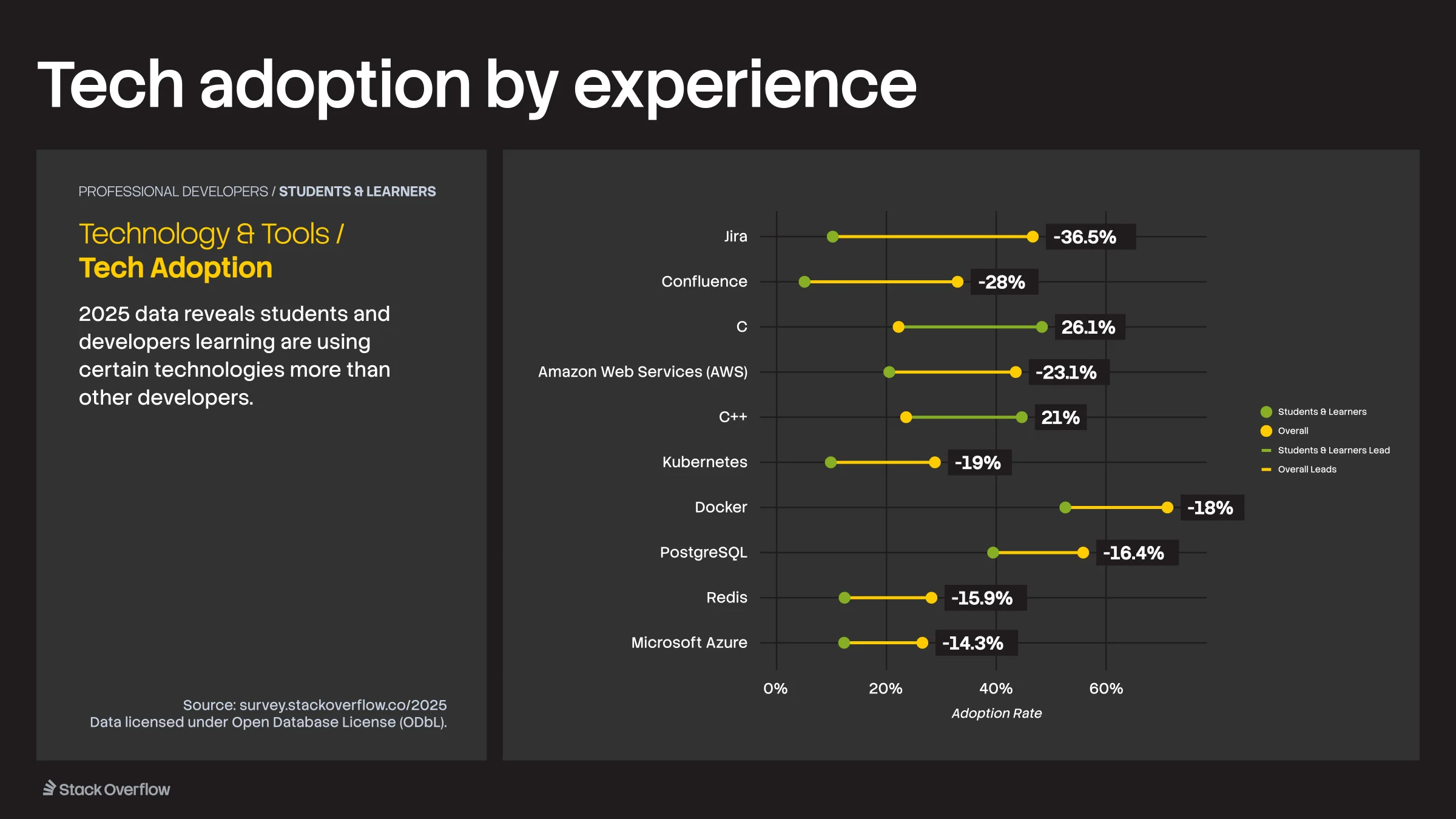
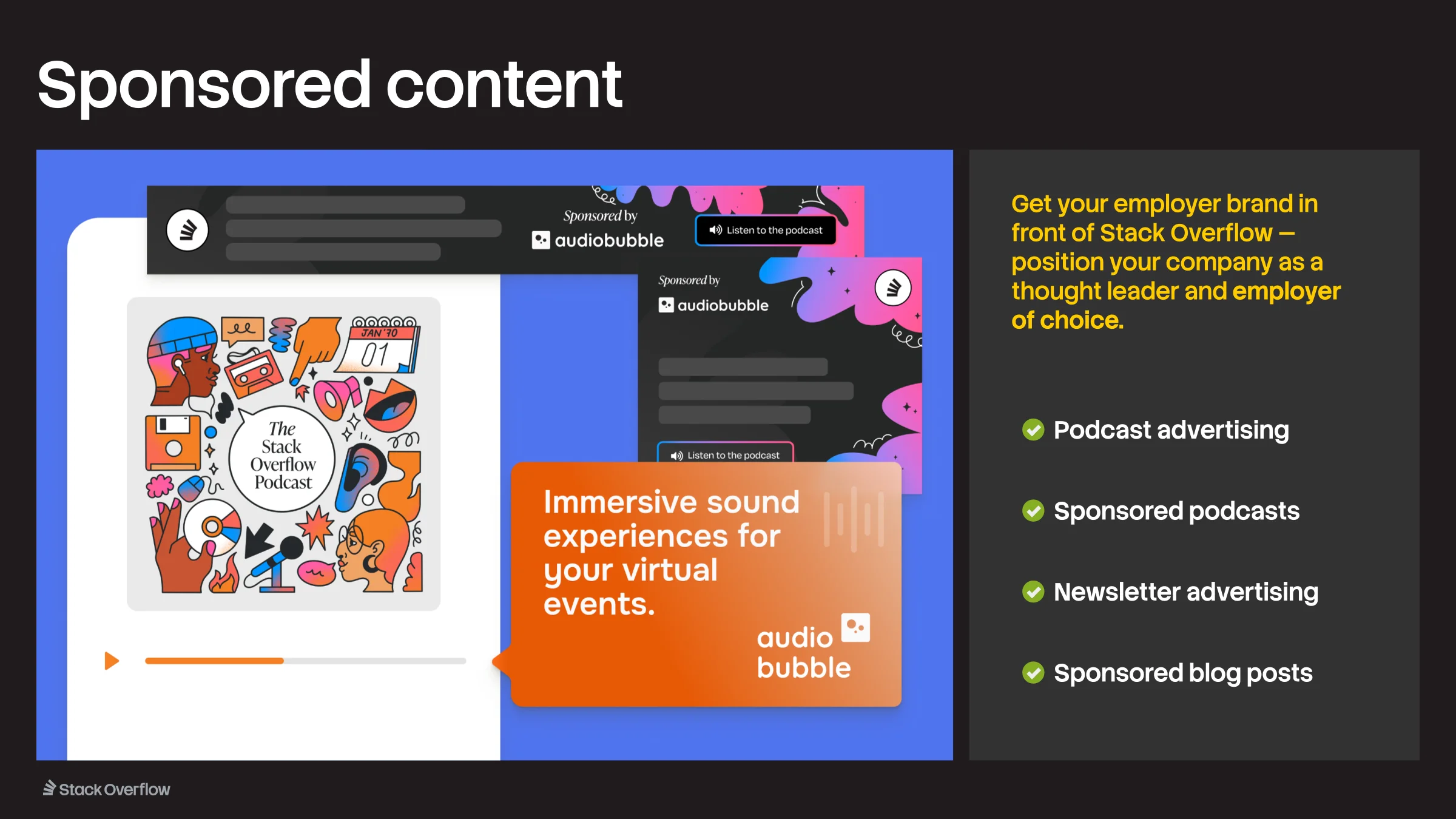
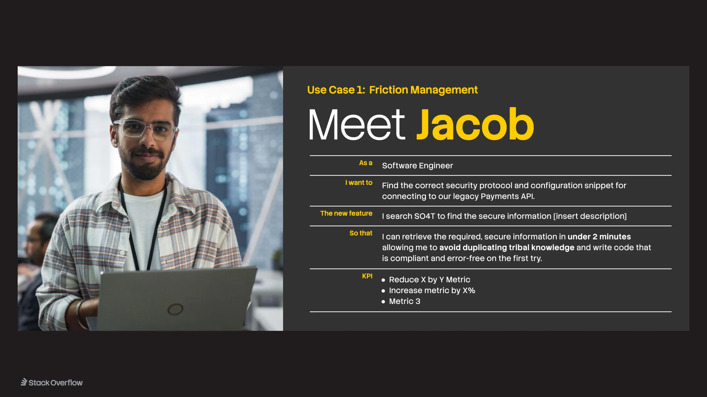
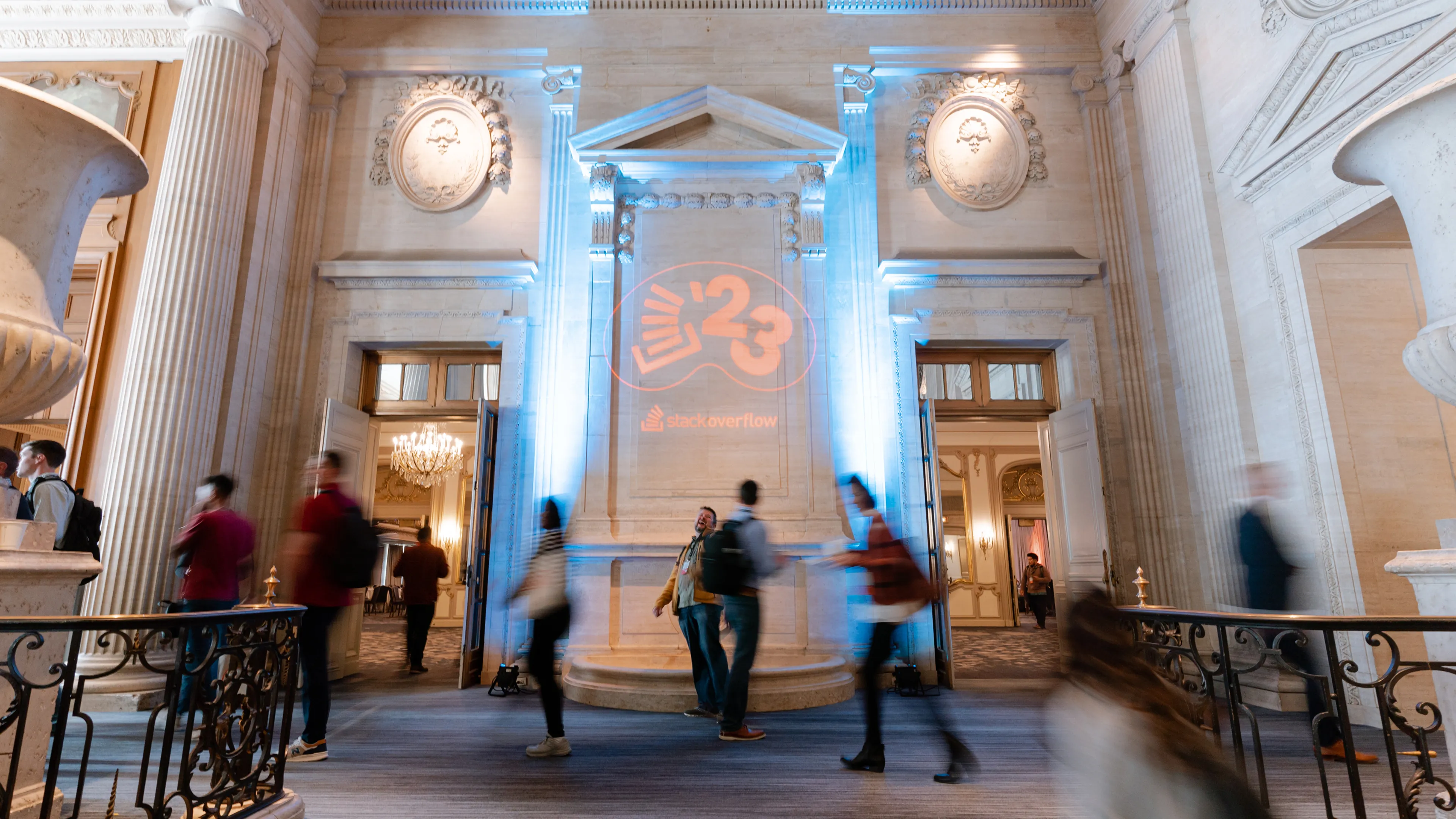
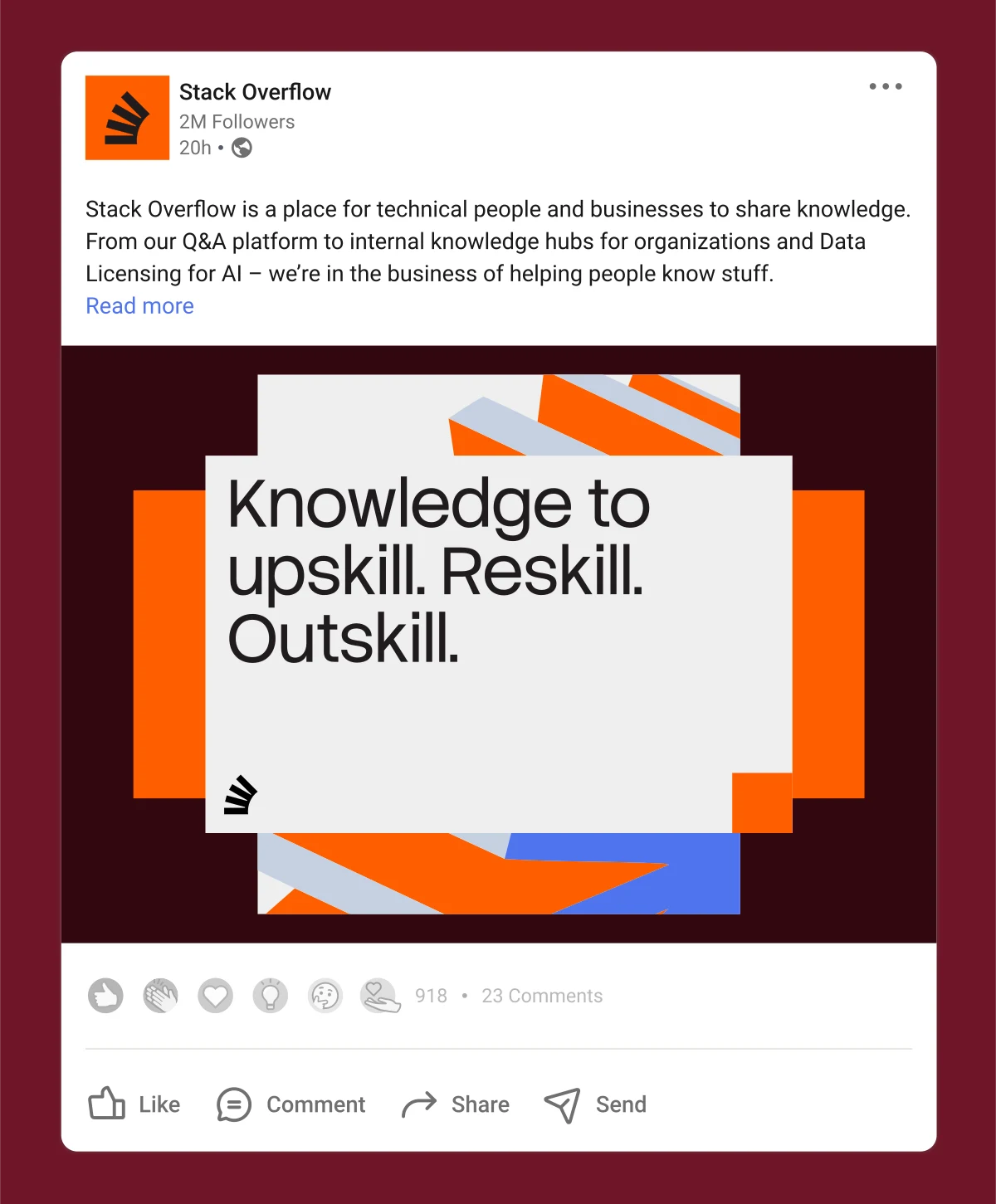
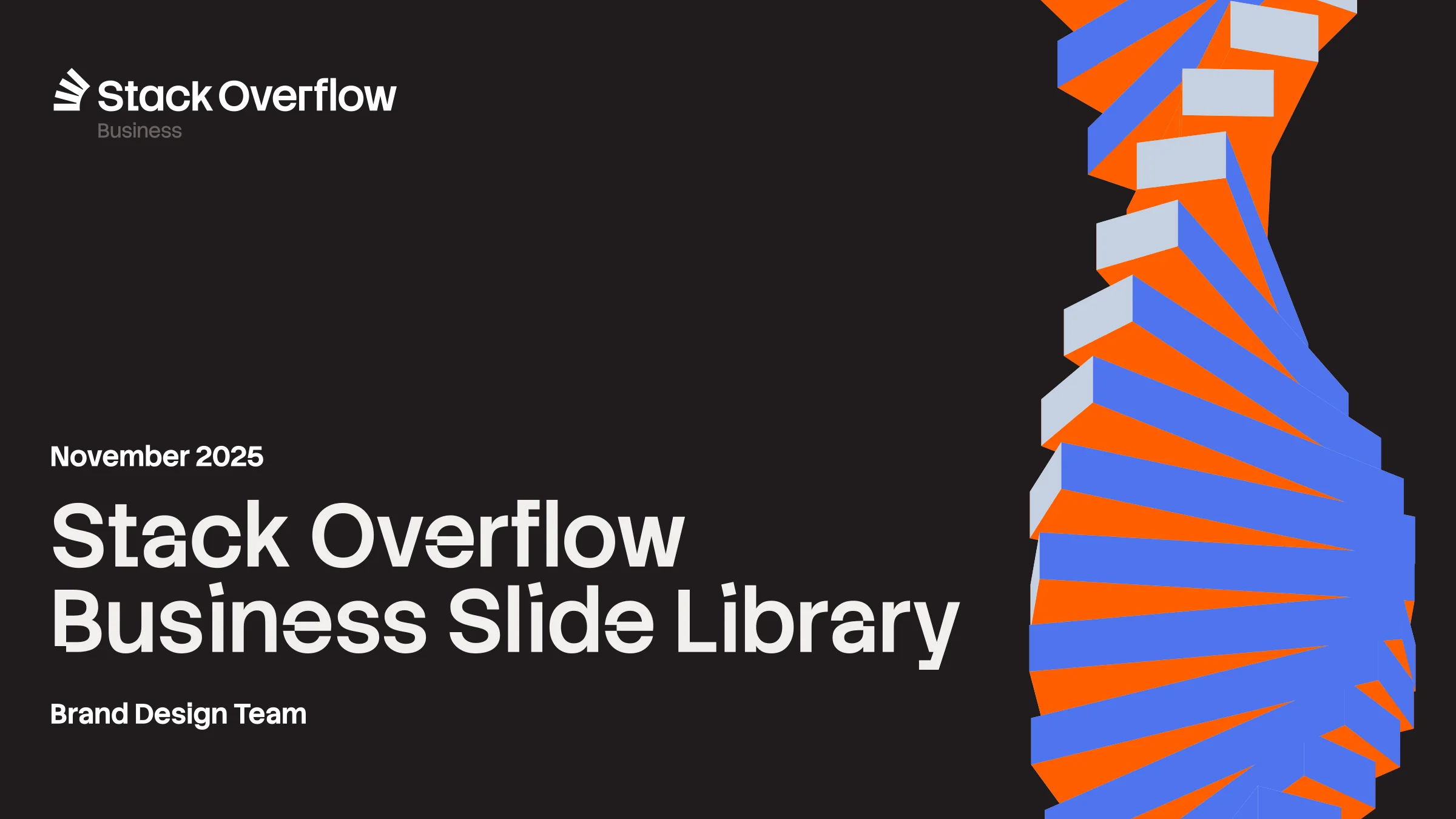
Then it had to ship. Over the next year the brand reached everything we touched: the launch of Stack Internal, booths from Ai4 to Microsoft Ignite, our podcasts, the Developer Survey, and every one of our Figma files, finally organized. Inside the company, the refreshed vision and mission gave Stack a clearer sense of itself, and put it in step with where the product is headed.

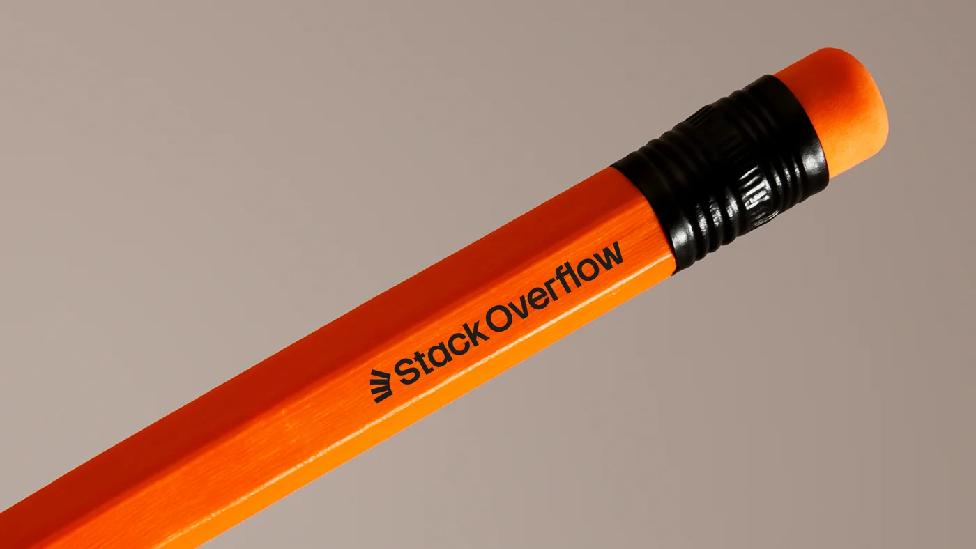
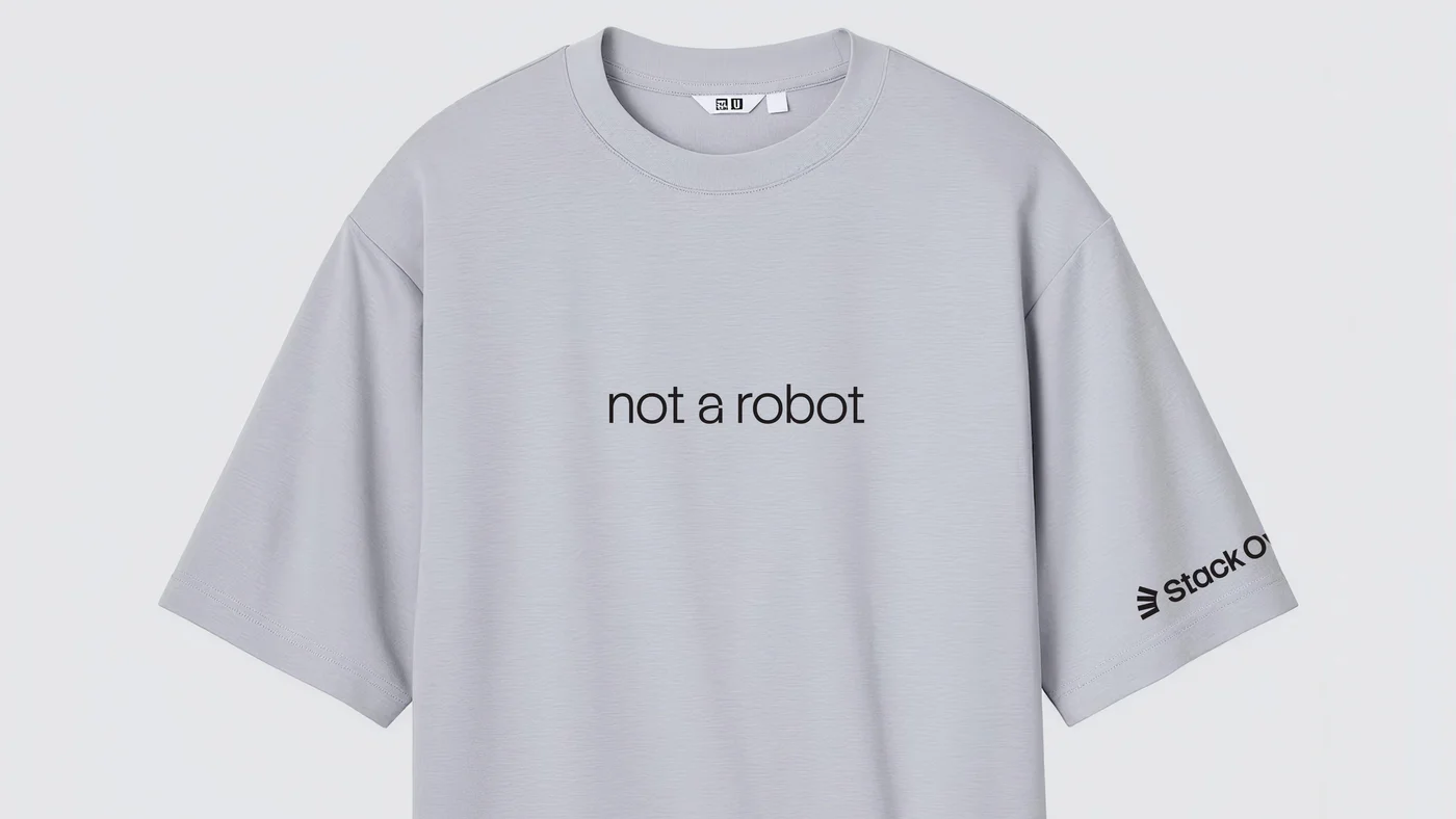
With Dave Longworth (Senior Director, Design), Koto (brand agency), and Stack Overflow’s product and marketing teams.
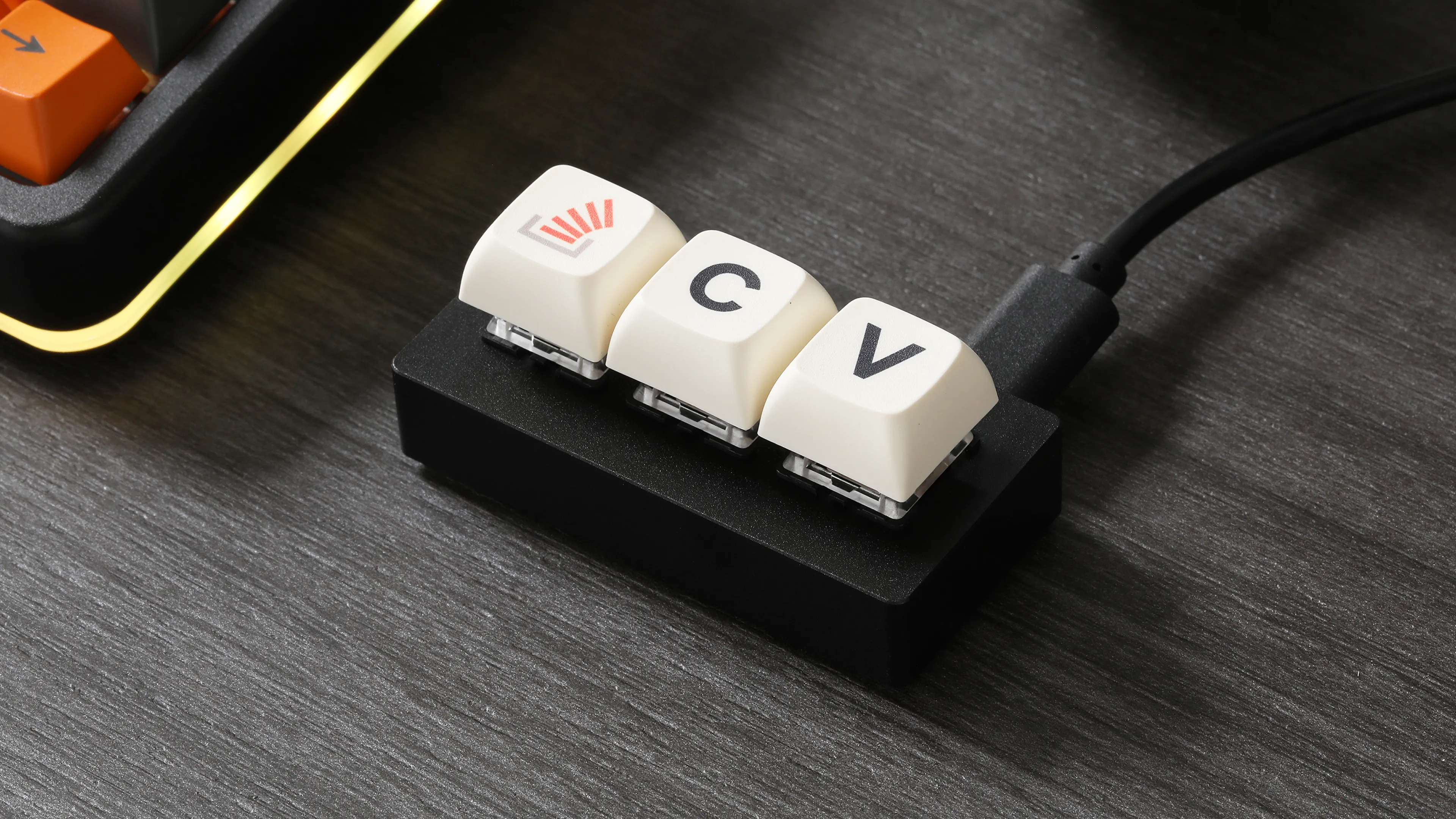
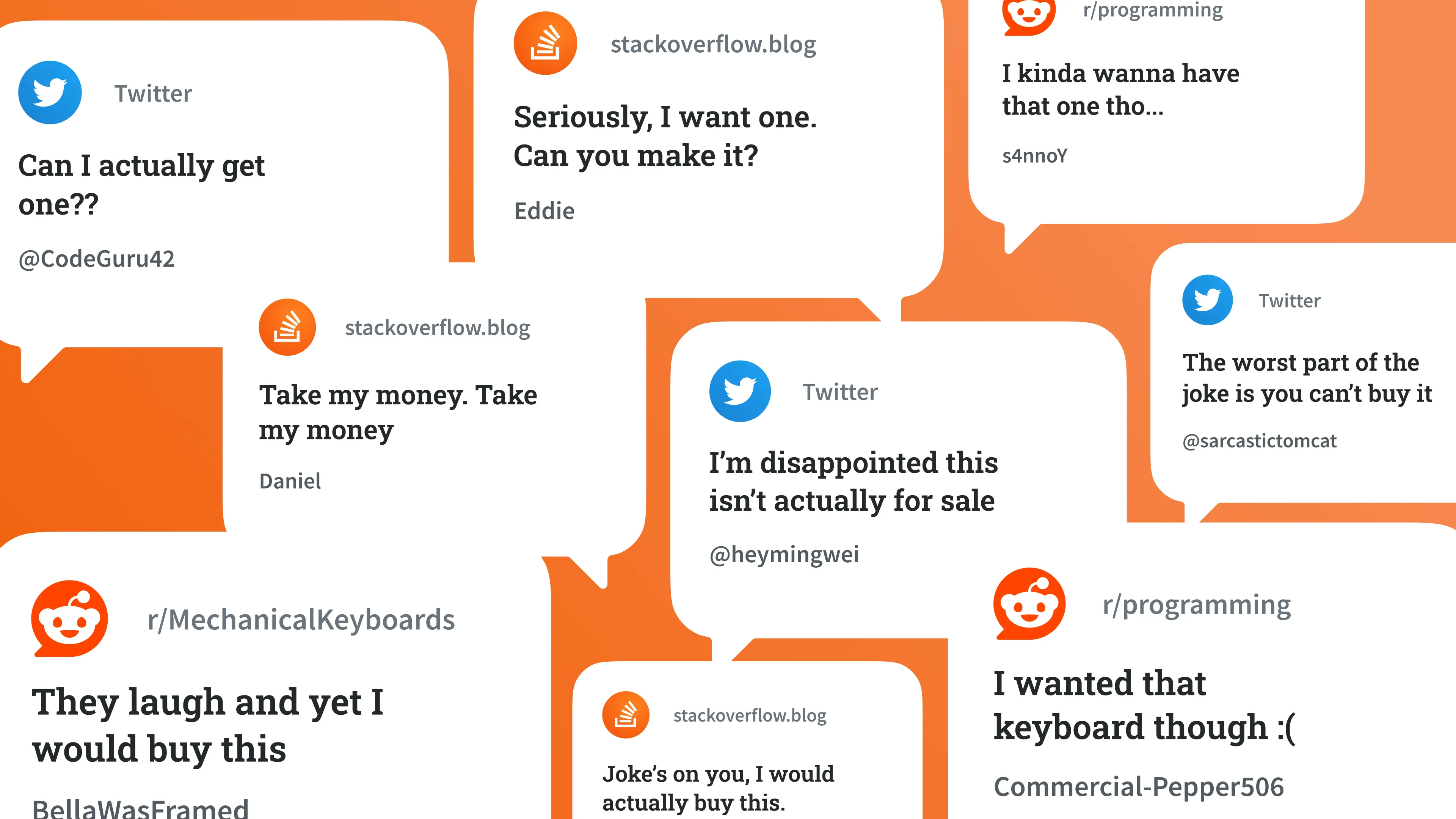
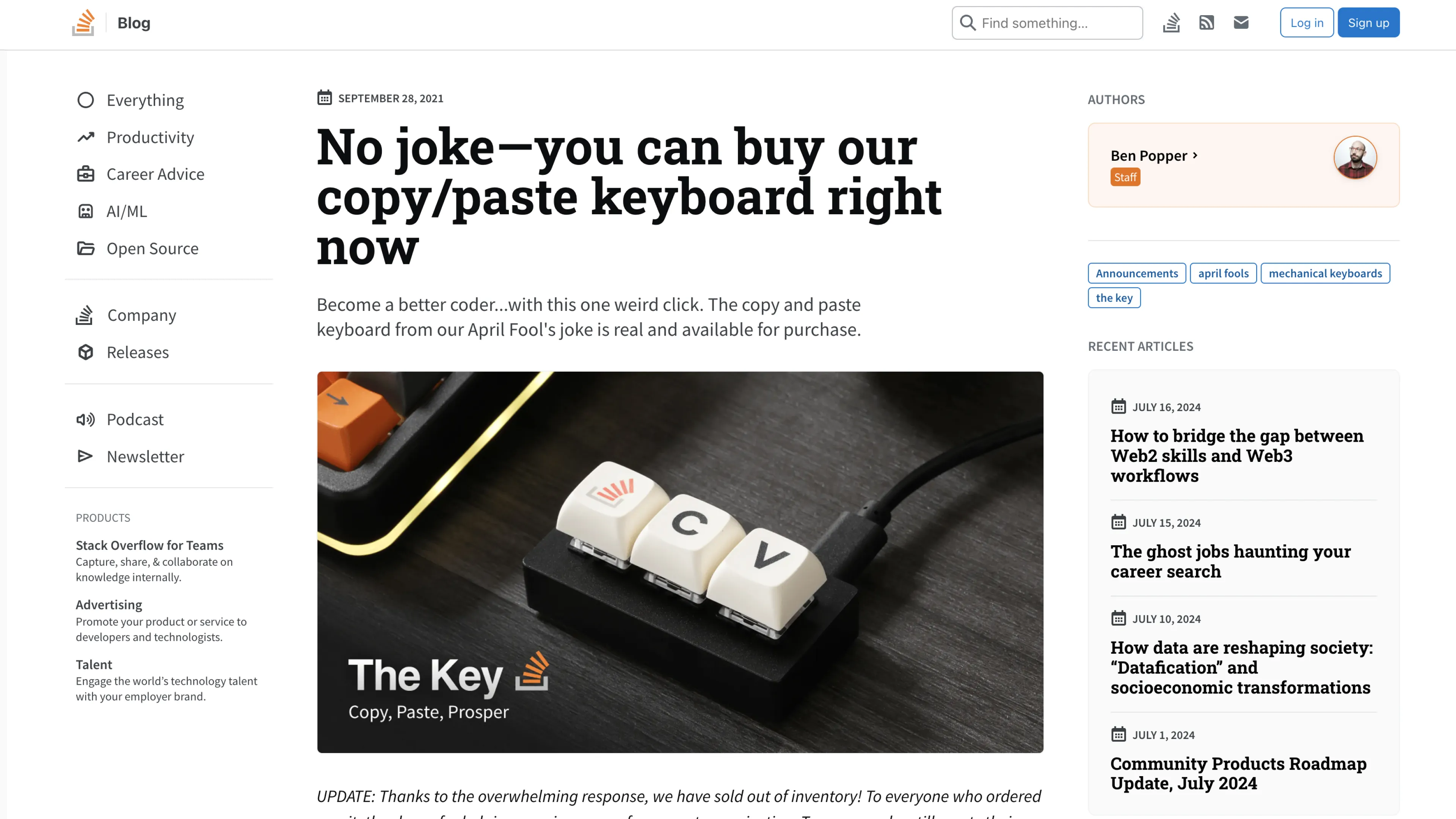
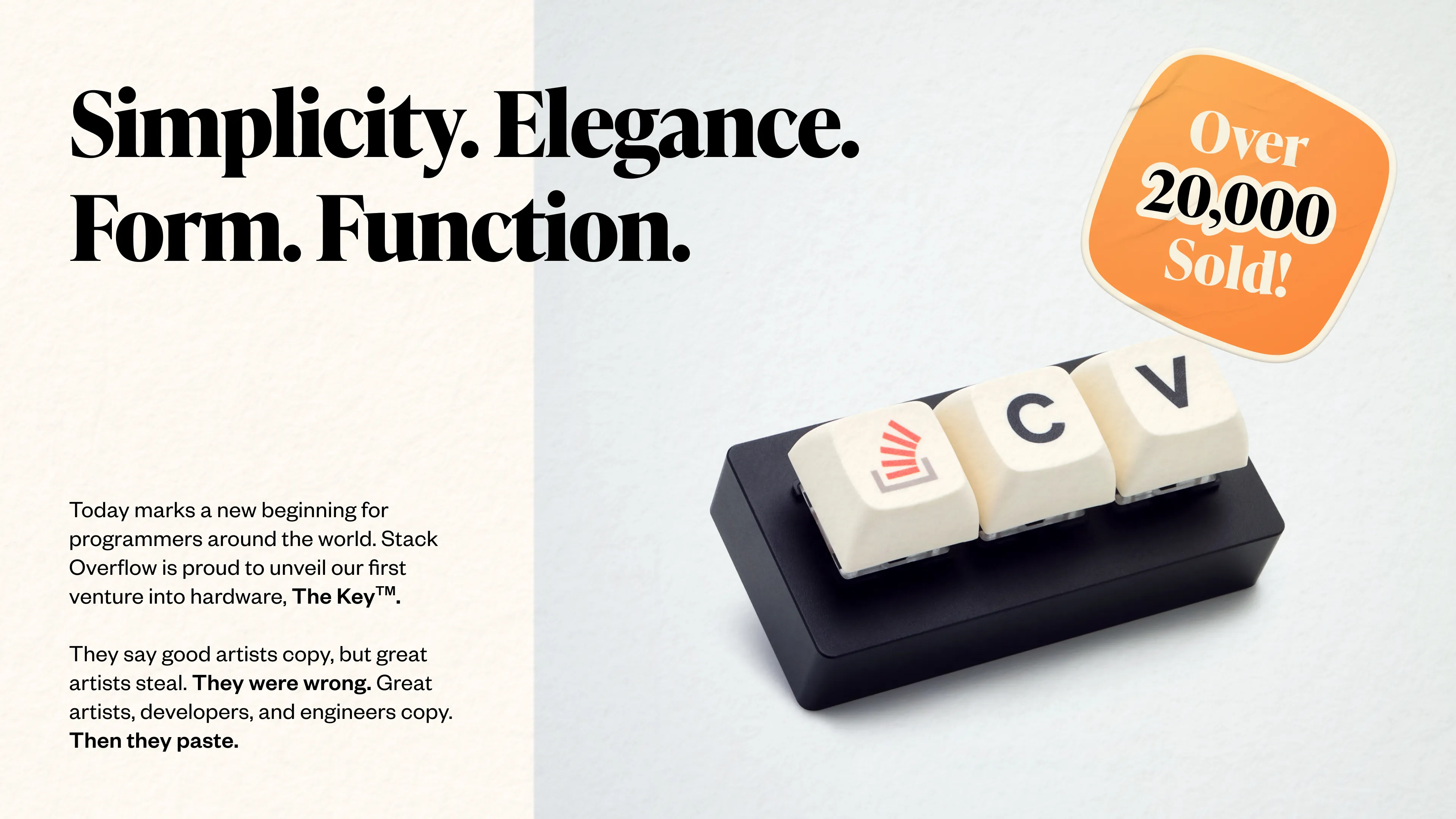
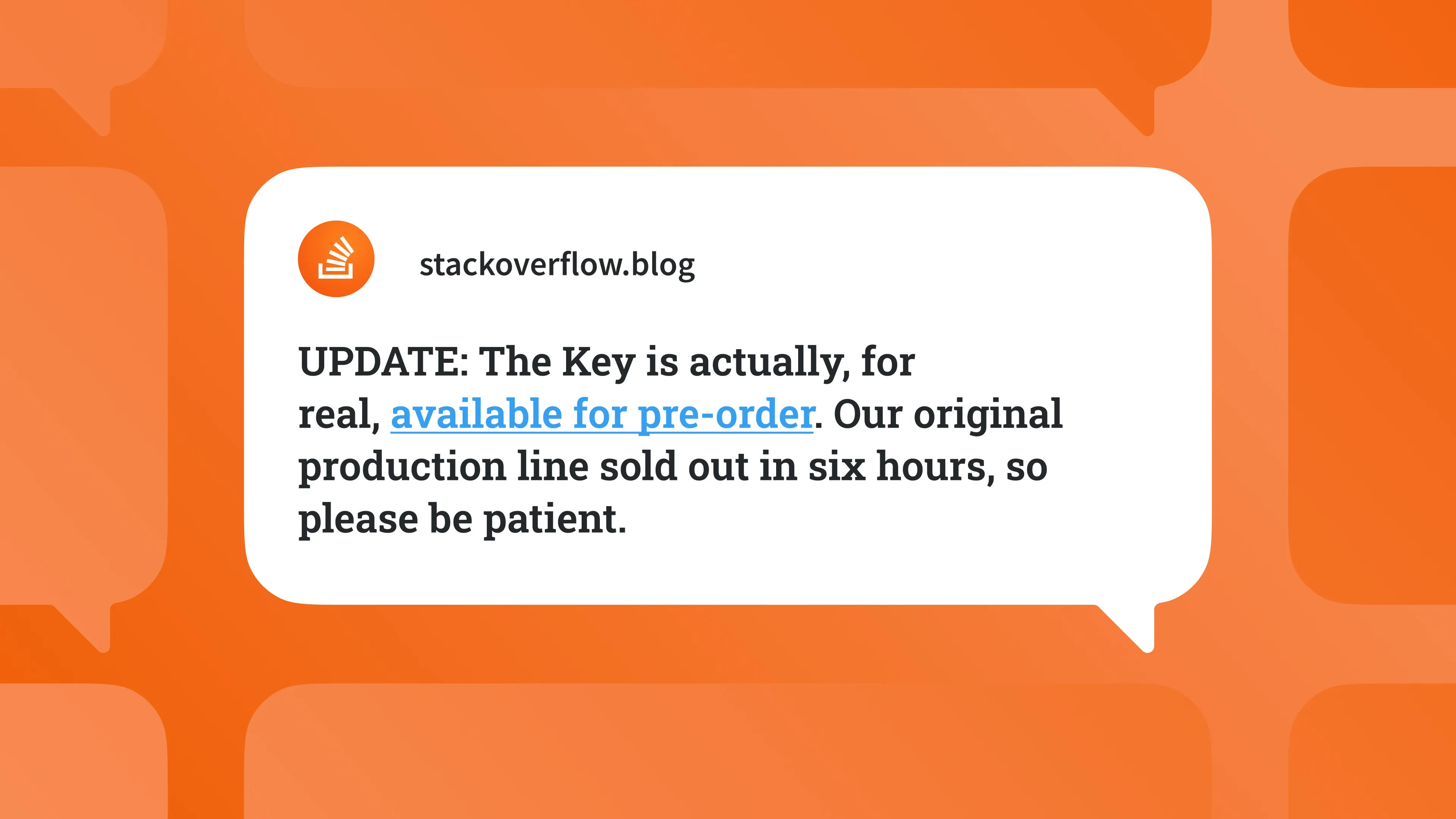
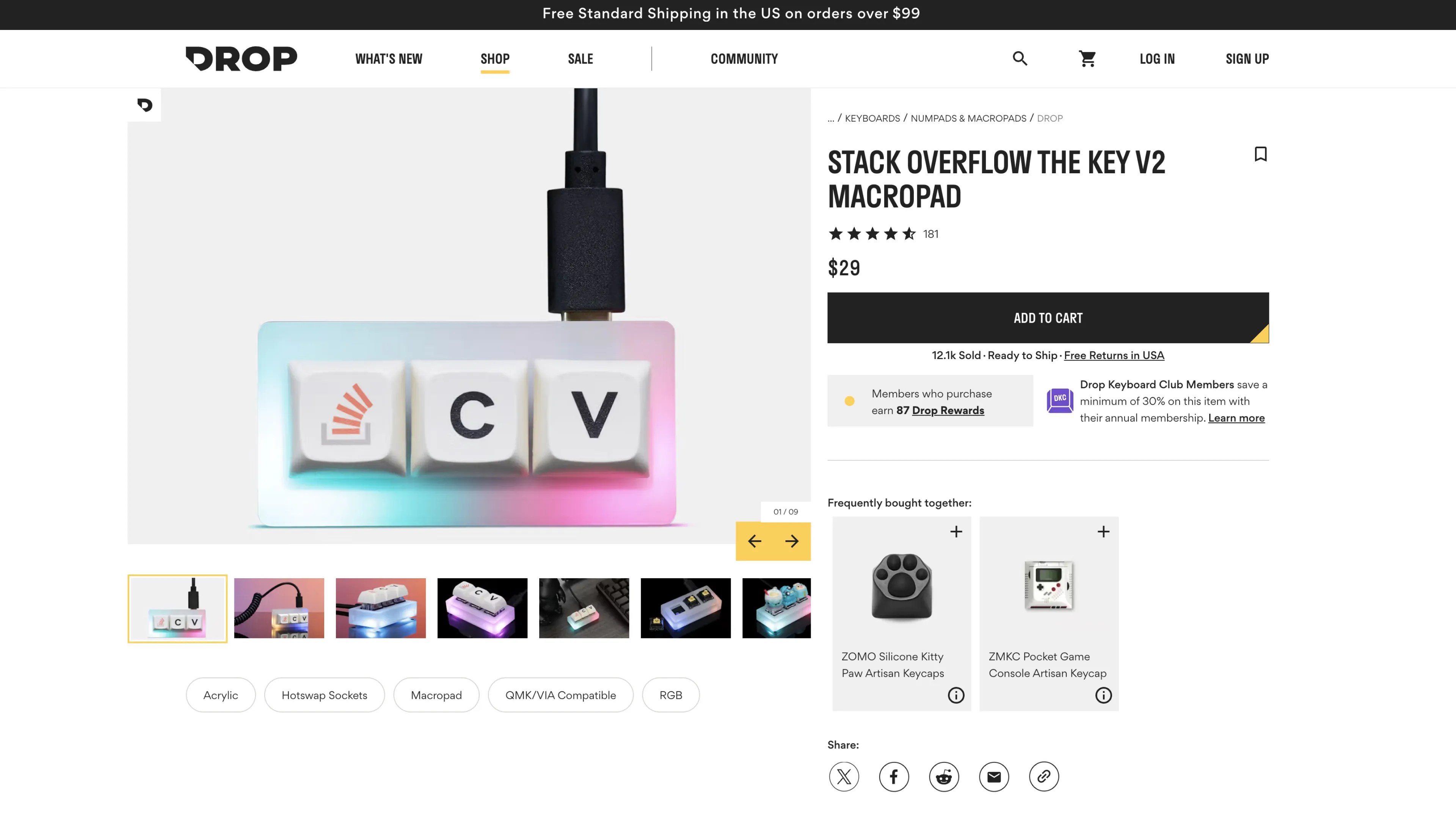
An April Fools joke turned real, sellable product.
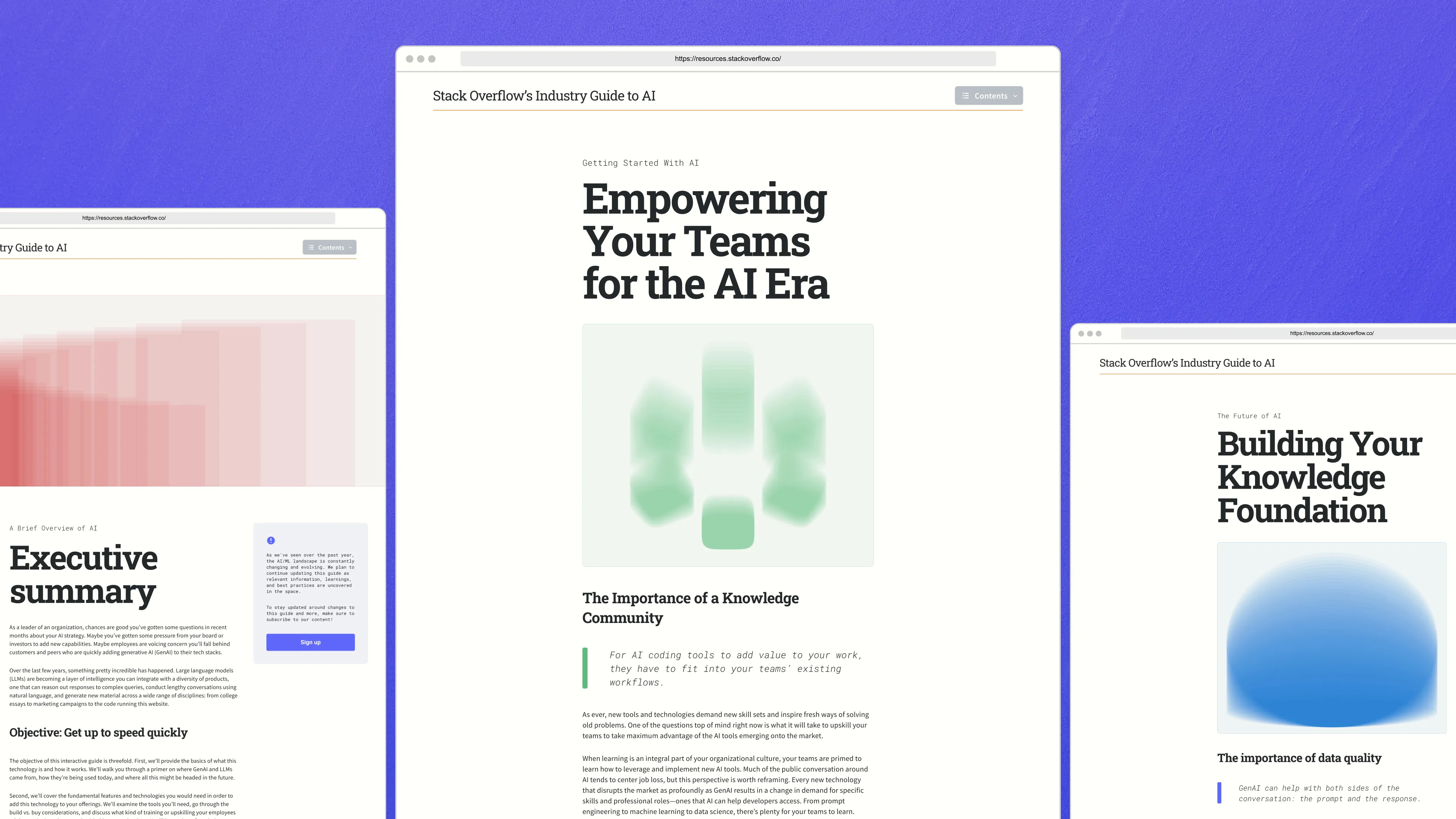
Hero and spot illustration library for a microsite guide to GenAI.
Product and promo animations for AI feature launch.
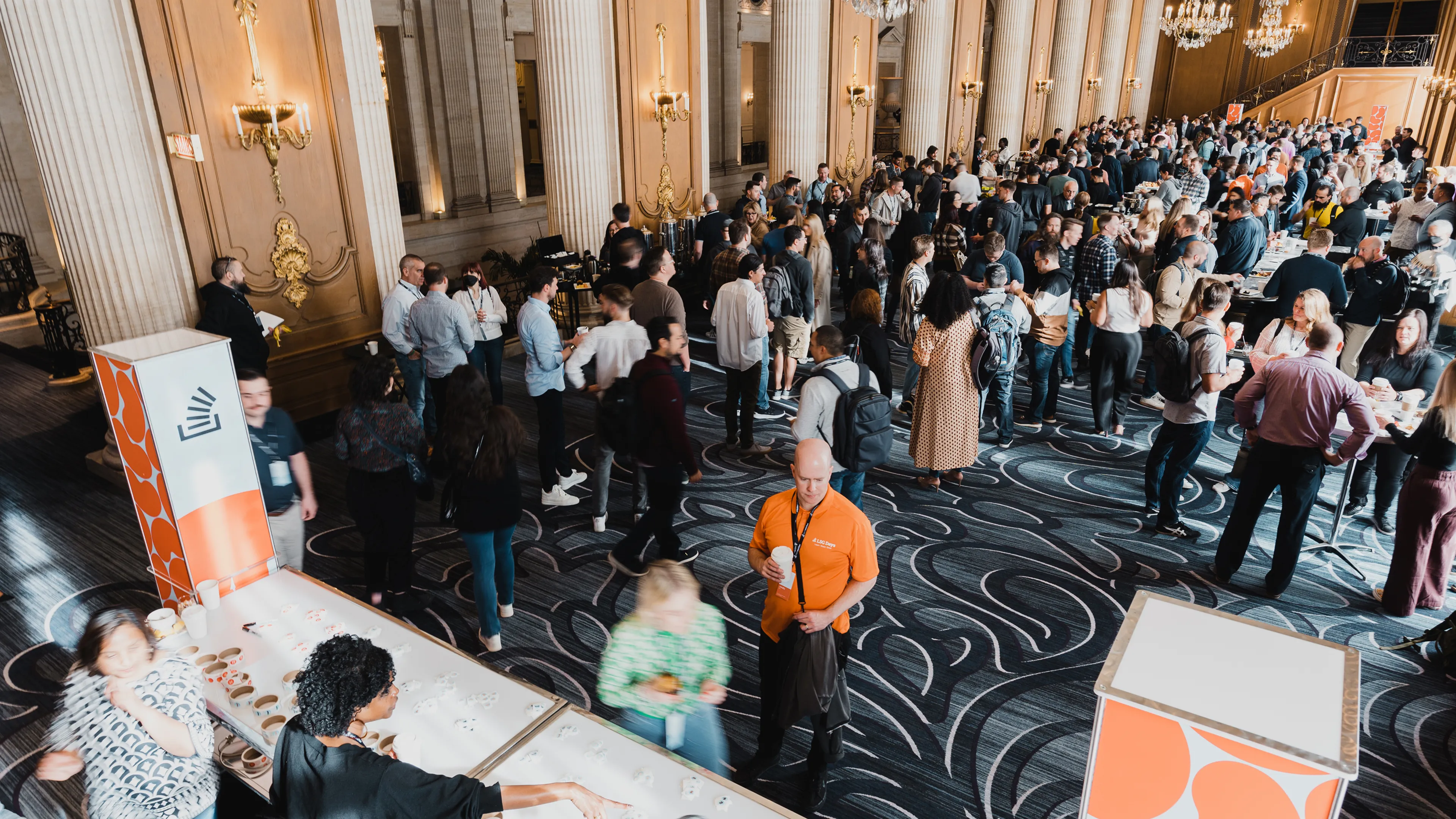
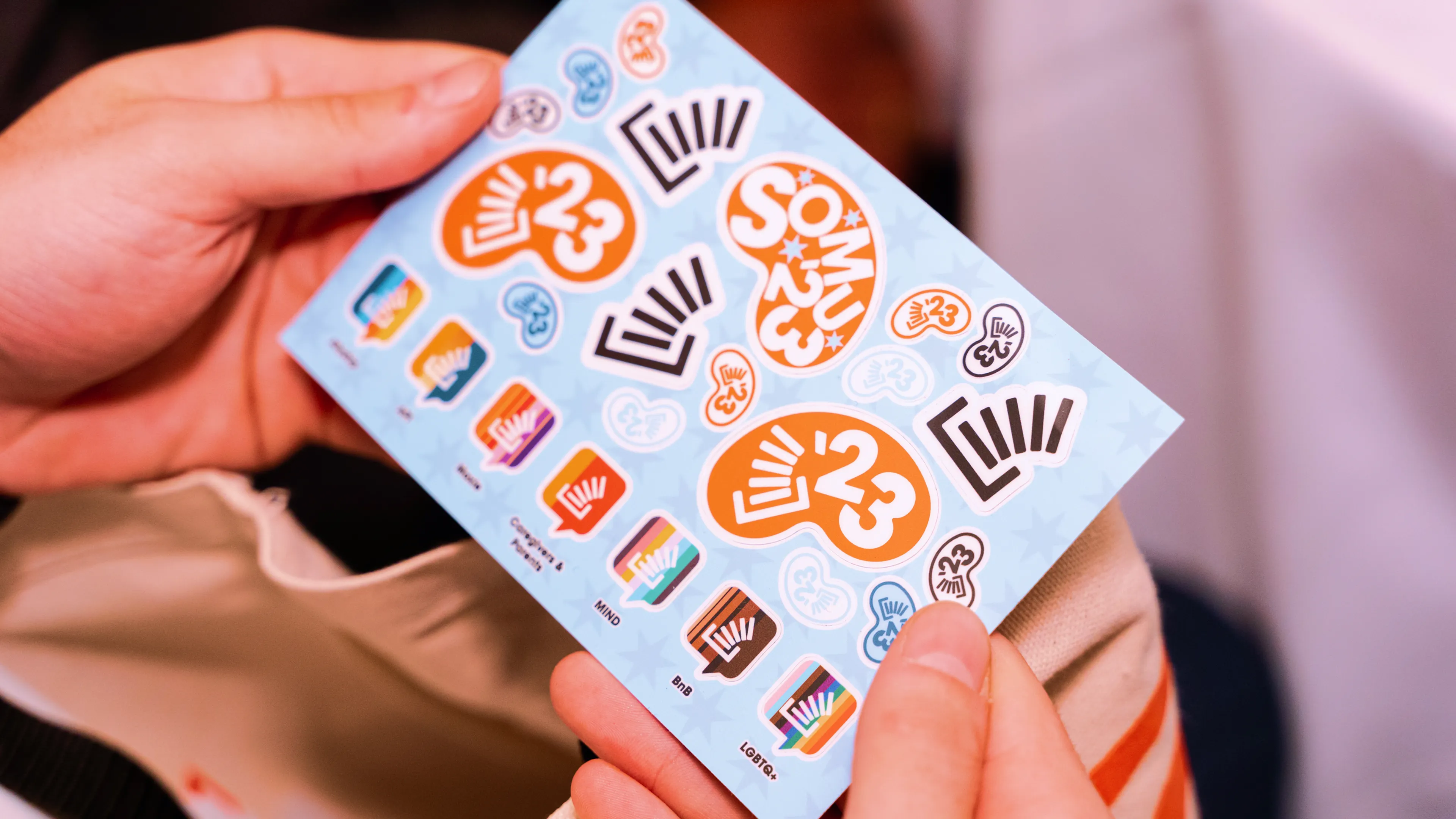
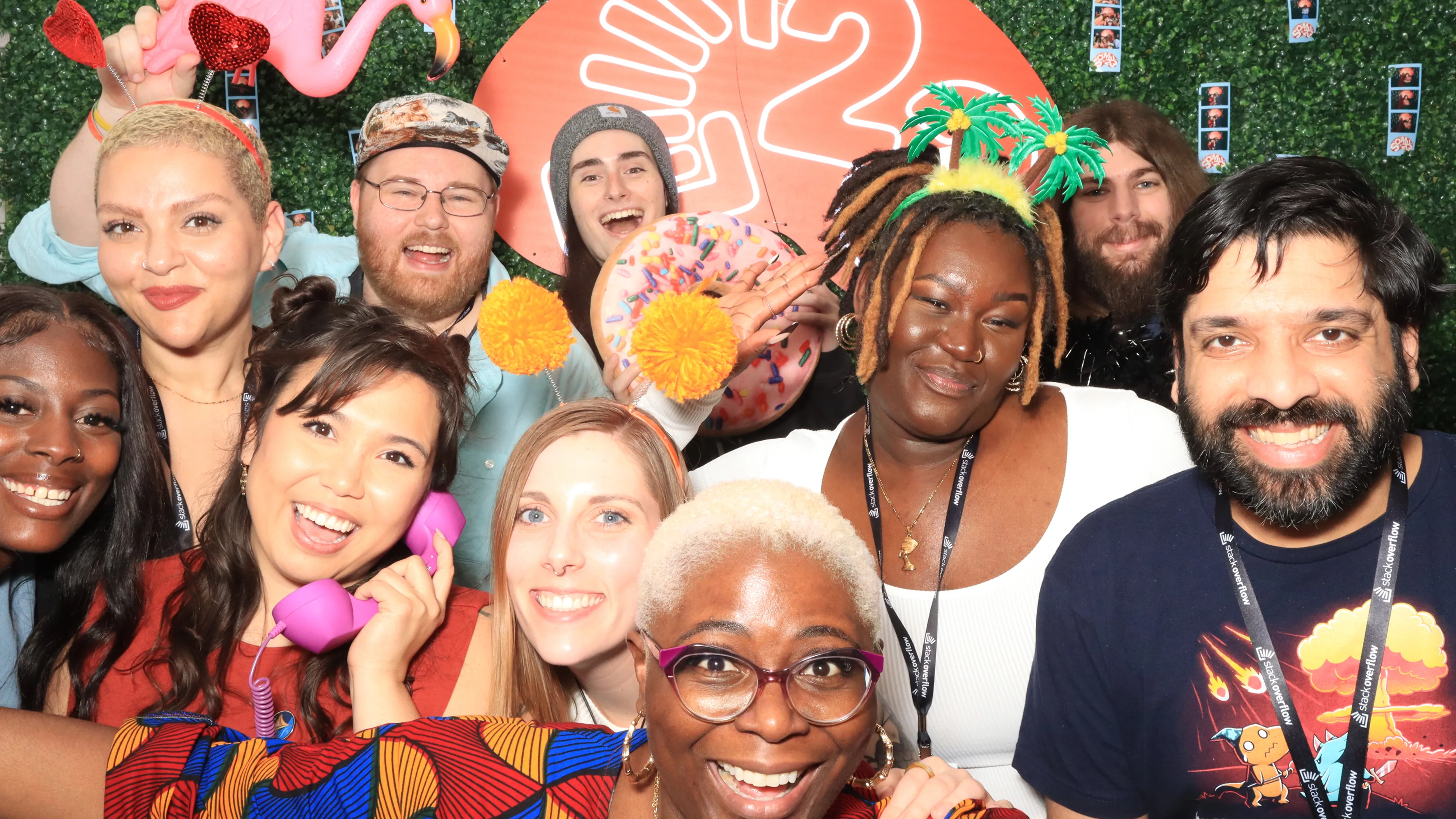
Internal meetup, brand and collateral, end to end.
Jake is a valued expert in the Stack brand. He provides valuable insight beyond design, particularly during the rebrand process — I so appreciate his points of view and candor.
David Longworth
Senior Director, Design,
Stack Overflow

I could put him in a room with a senior leader without hesitation and he’d hold his own with ease. If I had a full-time design position open, I would hire Jake immediately.
Molly Sullivan
Vice President, Brand,
Pegasystems

Thanks so much for being such a great client. We had a wicked time working with you and Dave — I hope we get the chance to work together again.
Joe Ling
Creative Director,
Koto

Jake’s systematic approach was critical to Tulip’s brand update. His token-based asset templates made it easy for the team to produce on-brand materials independently.
Madilynn Castillo
Chief Marketing Officer,
Tulip

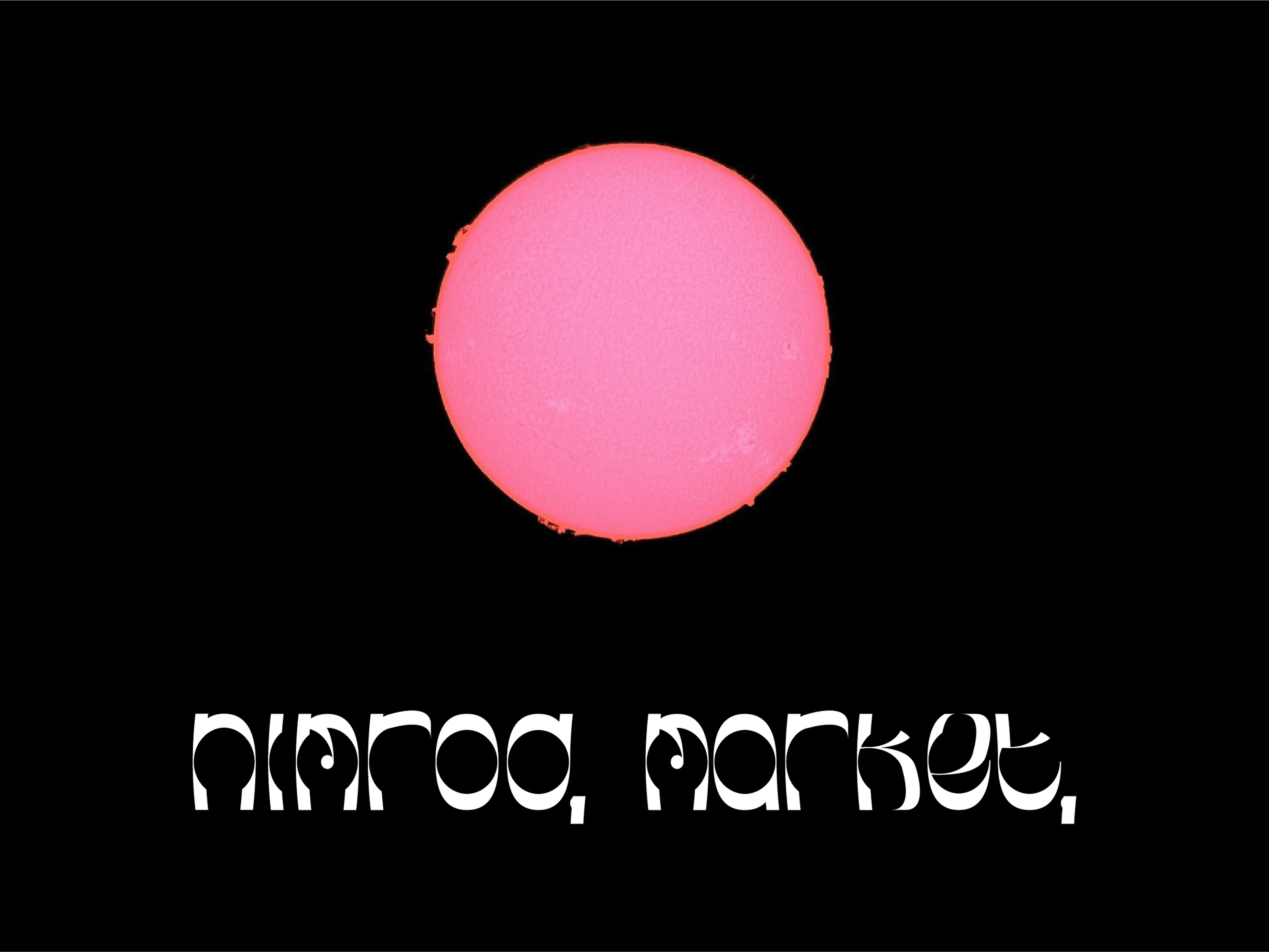
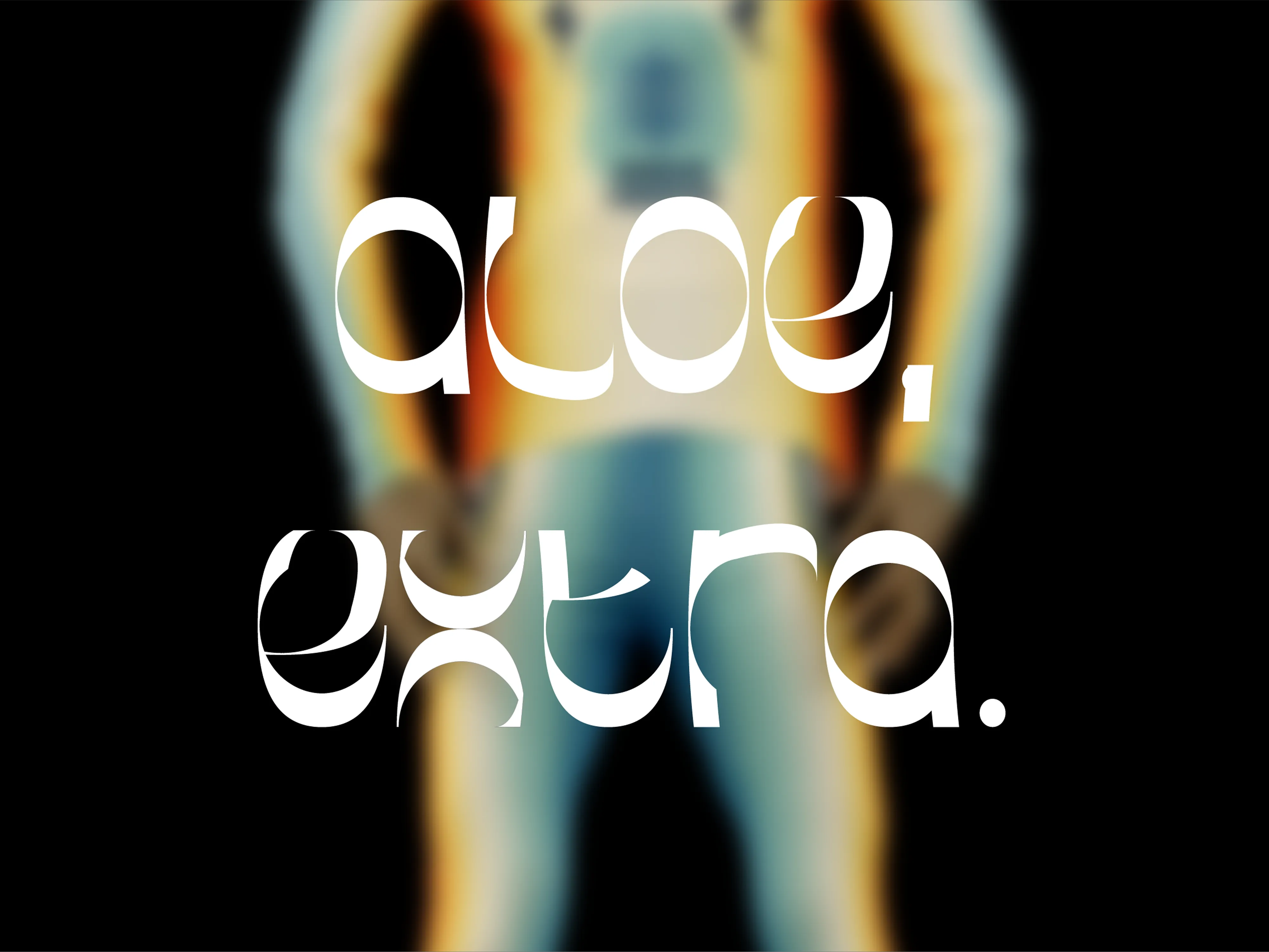
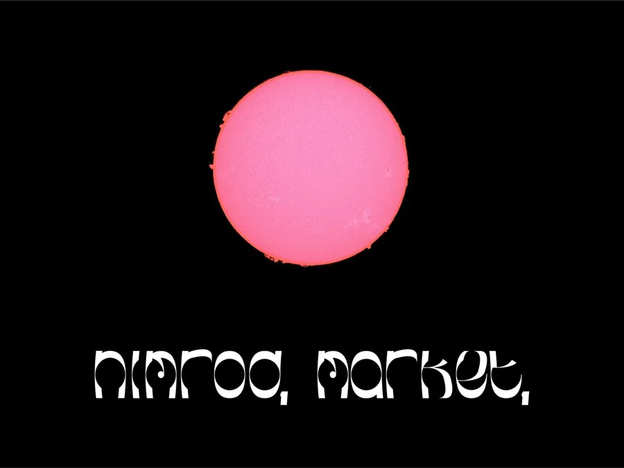
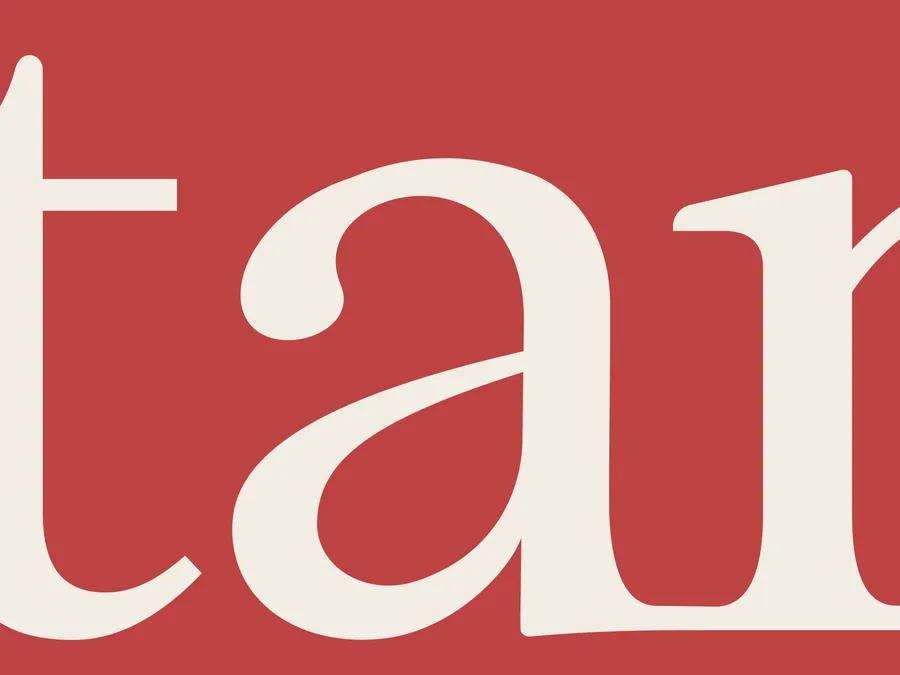
Æ, a display face, and Qoph, a serif
Charcoal & Ink drawings
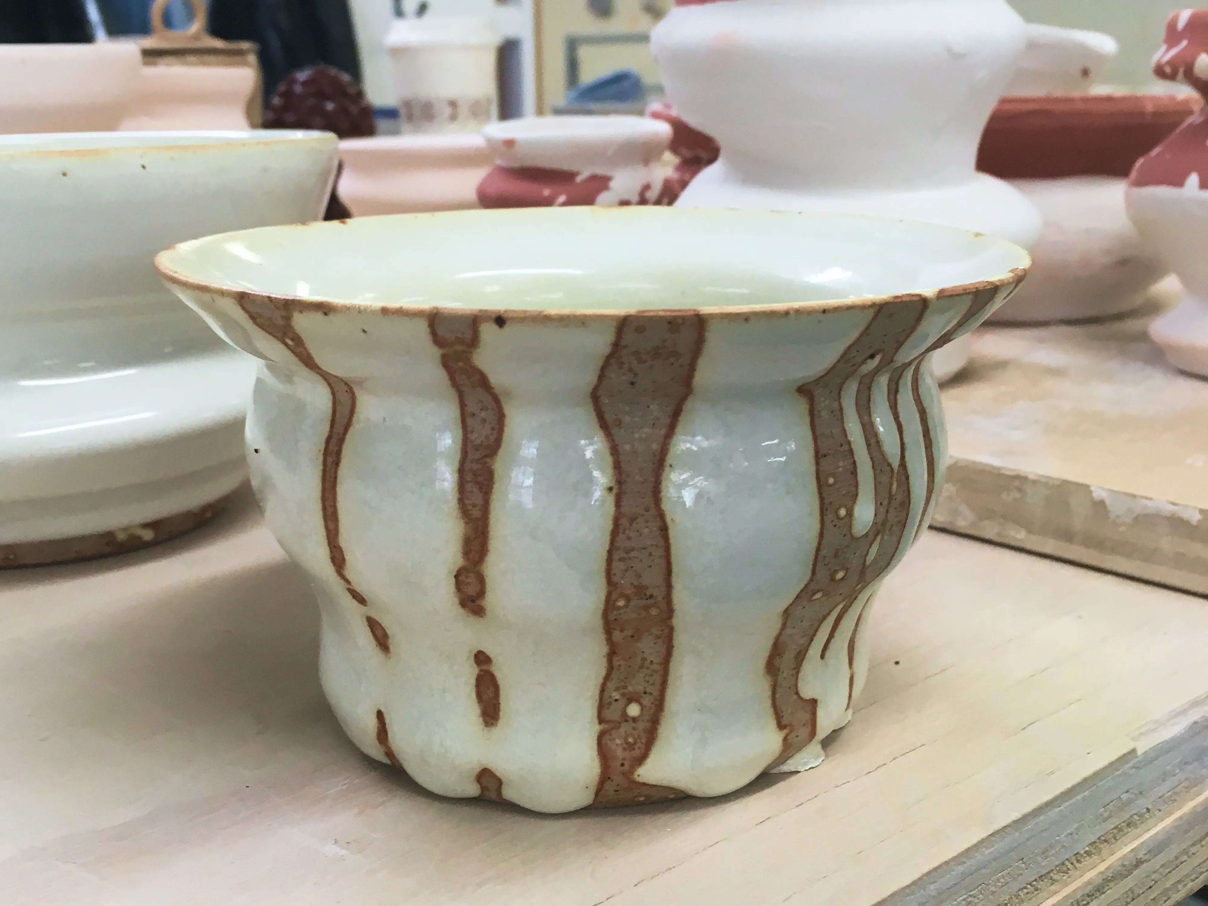
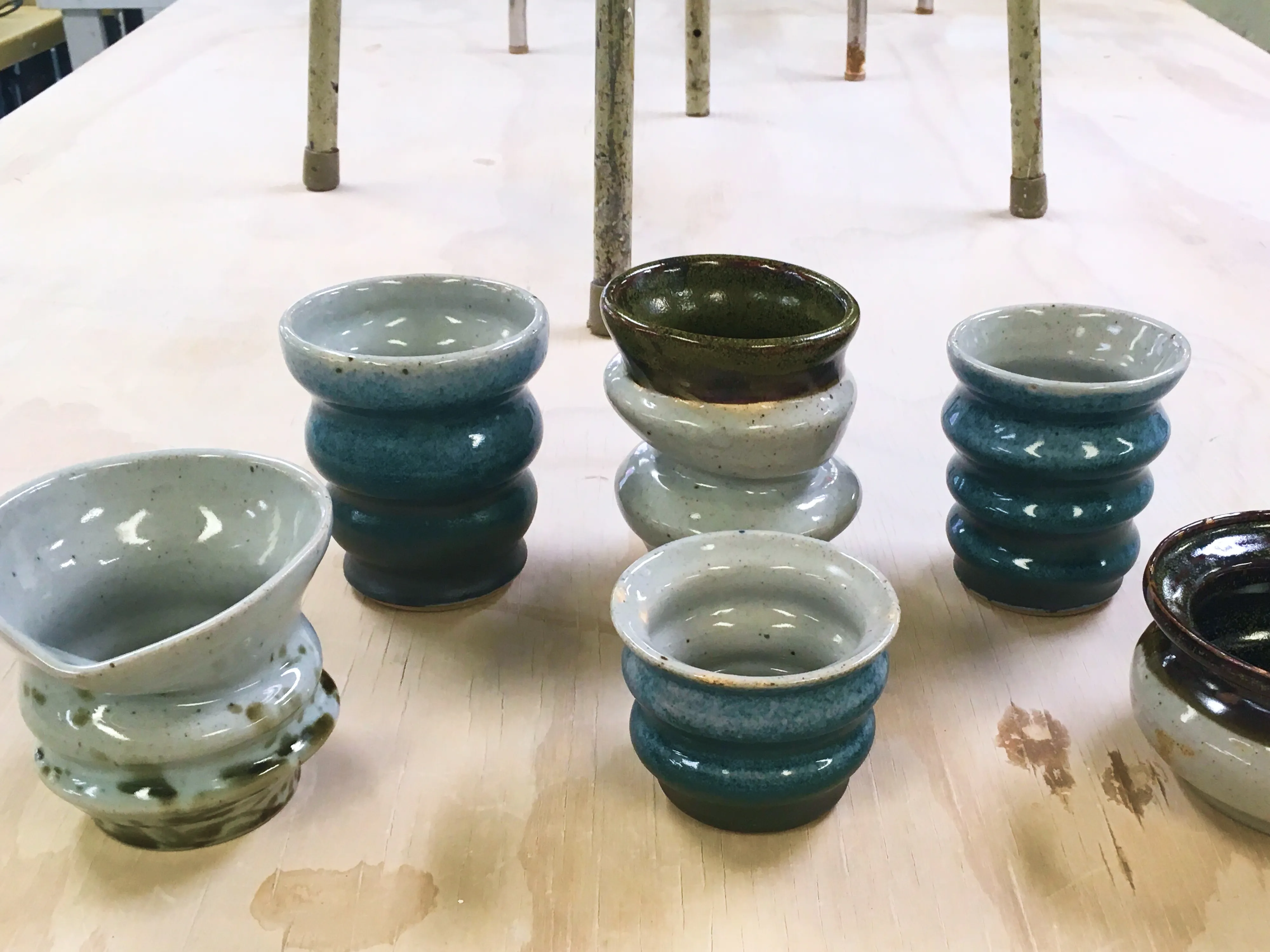
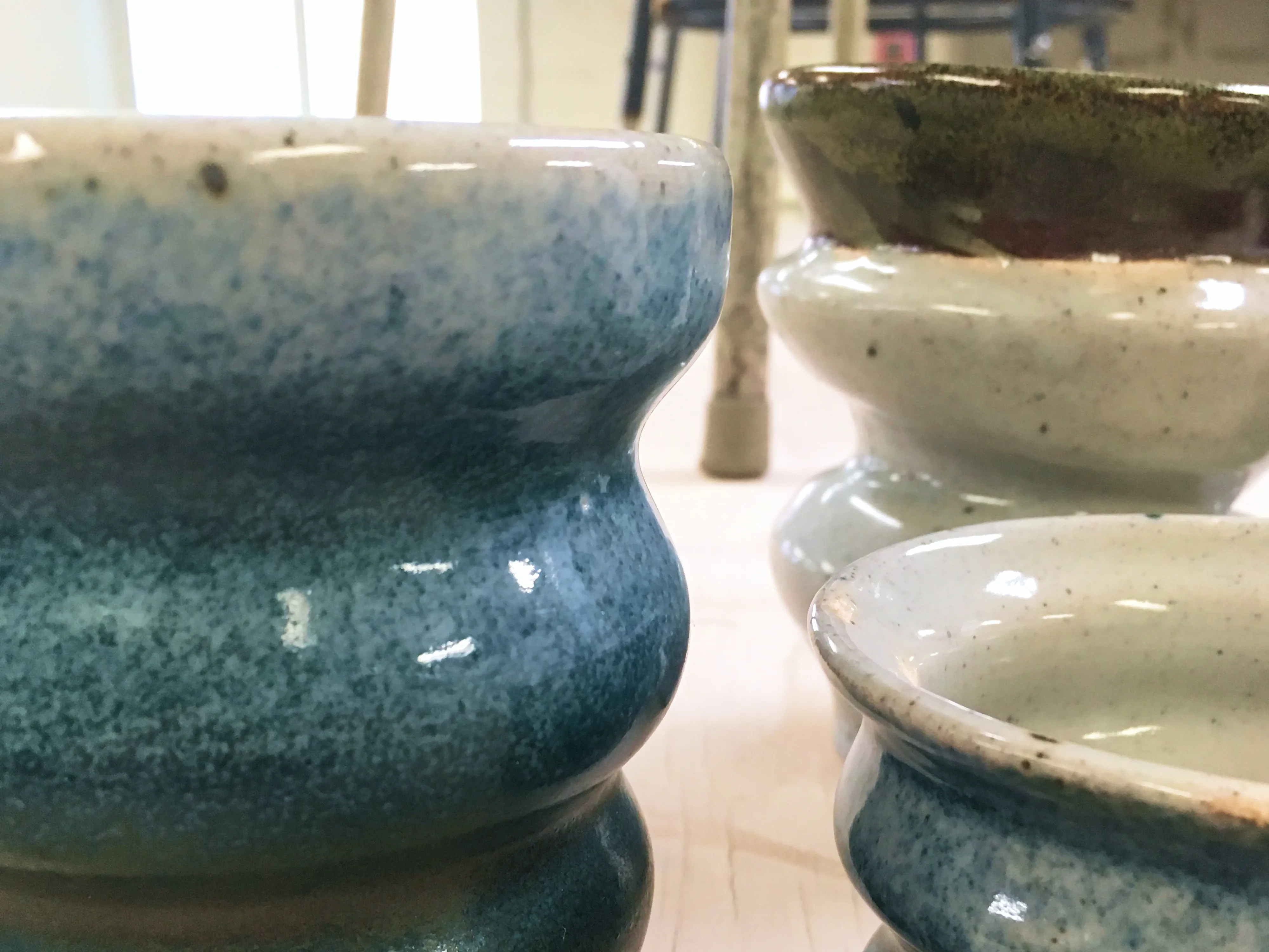
Recent pottery
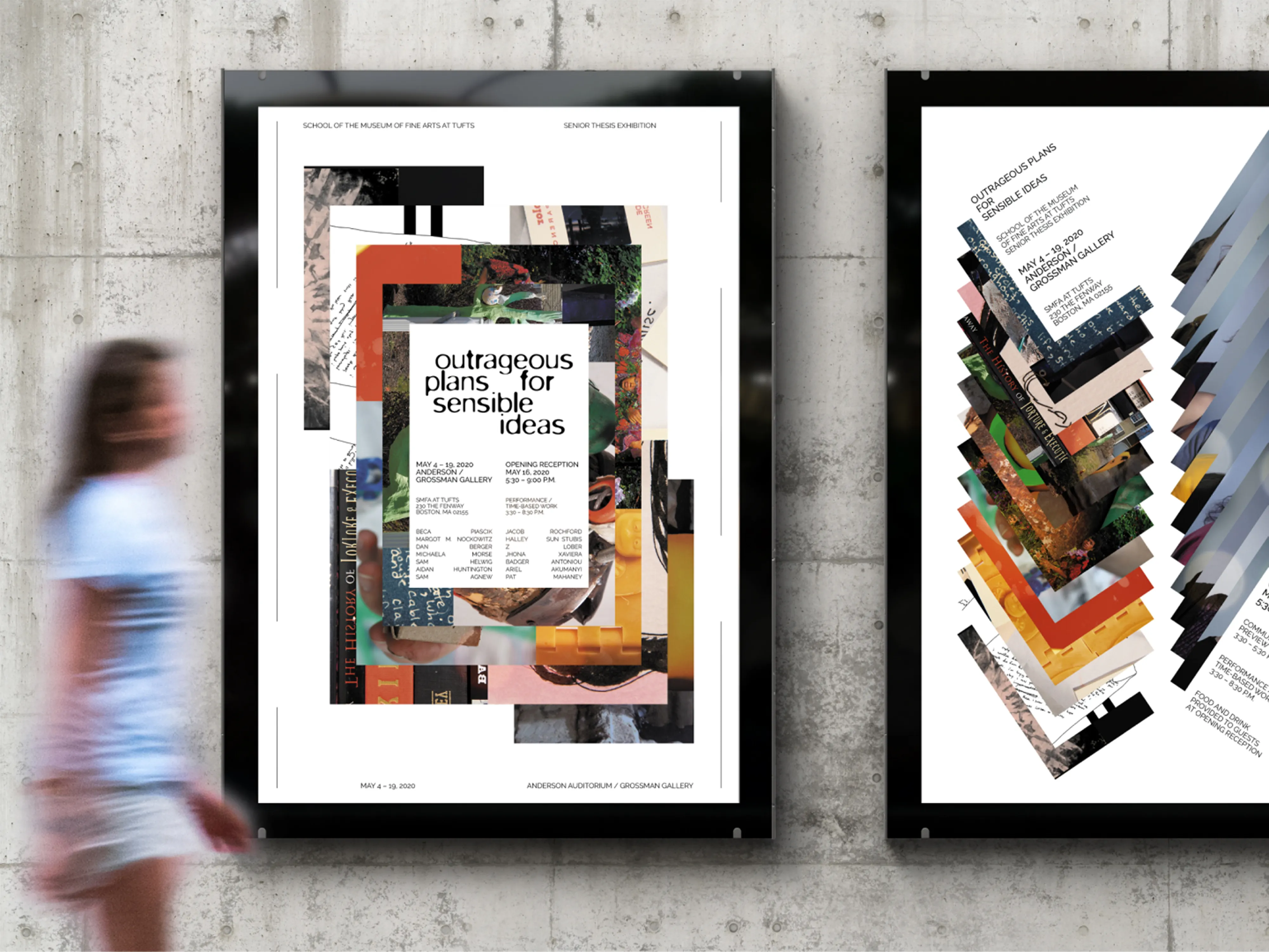
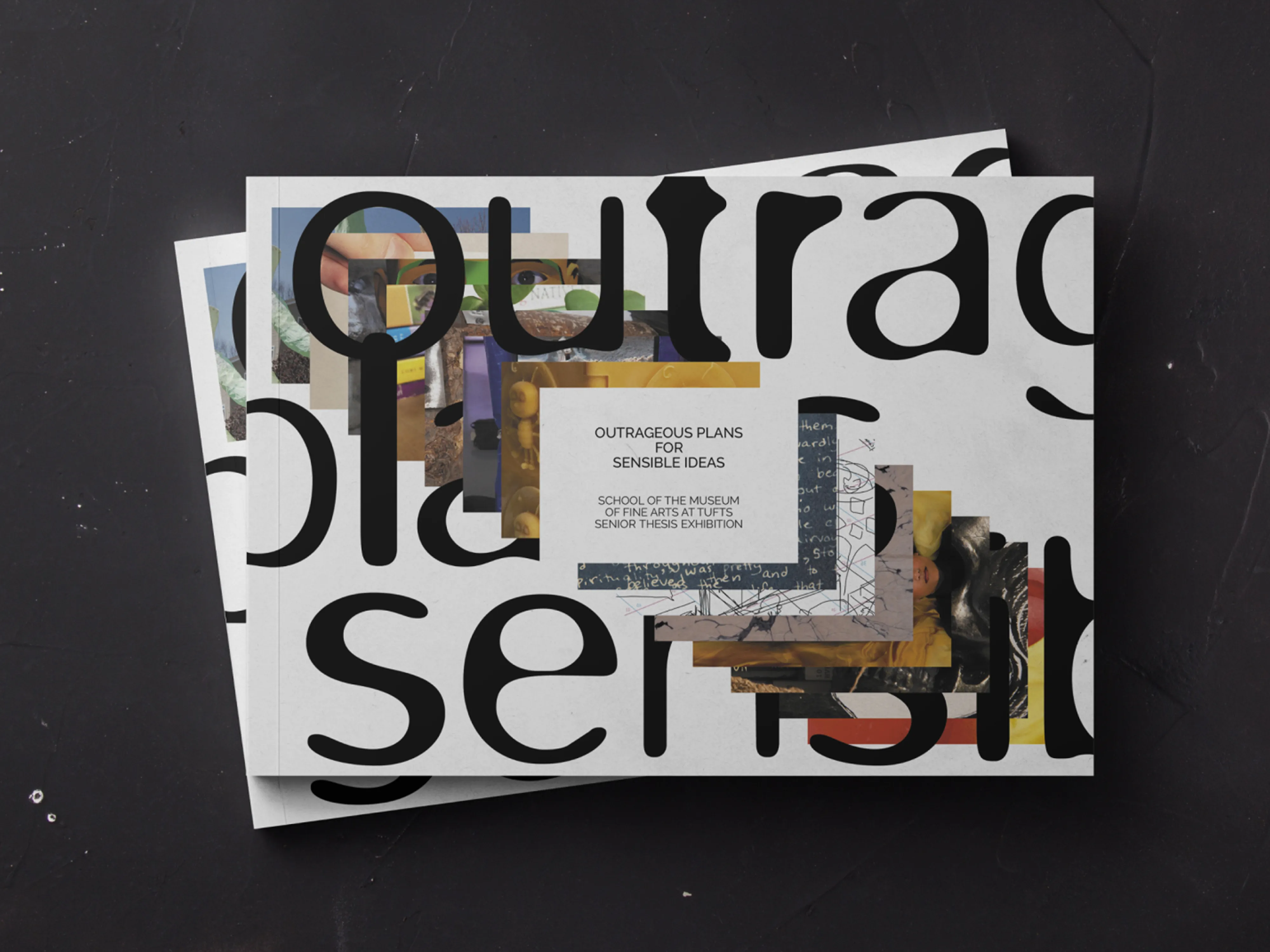
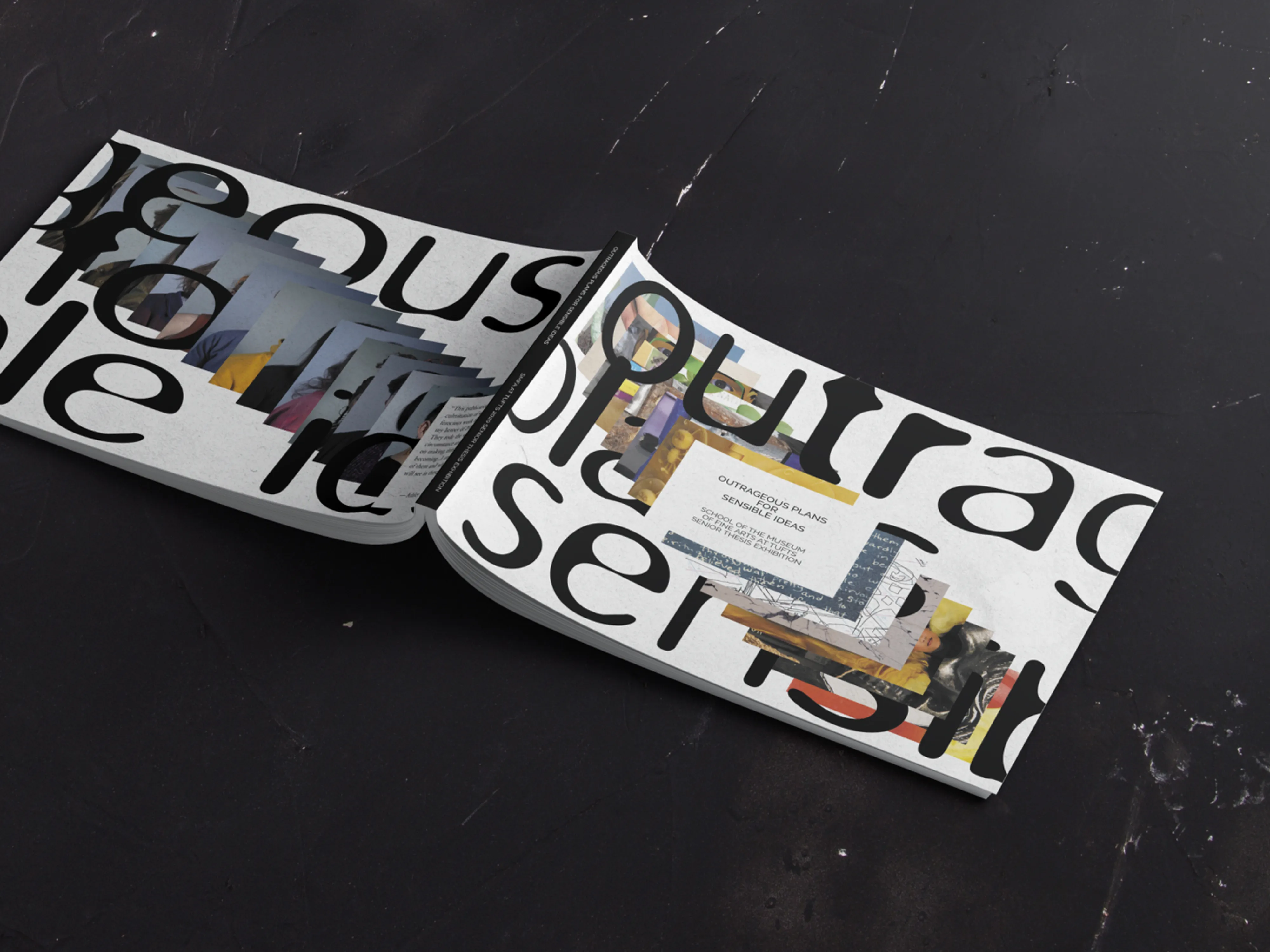
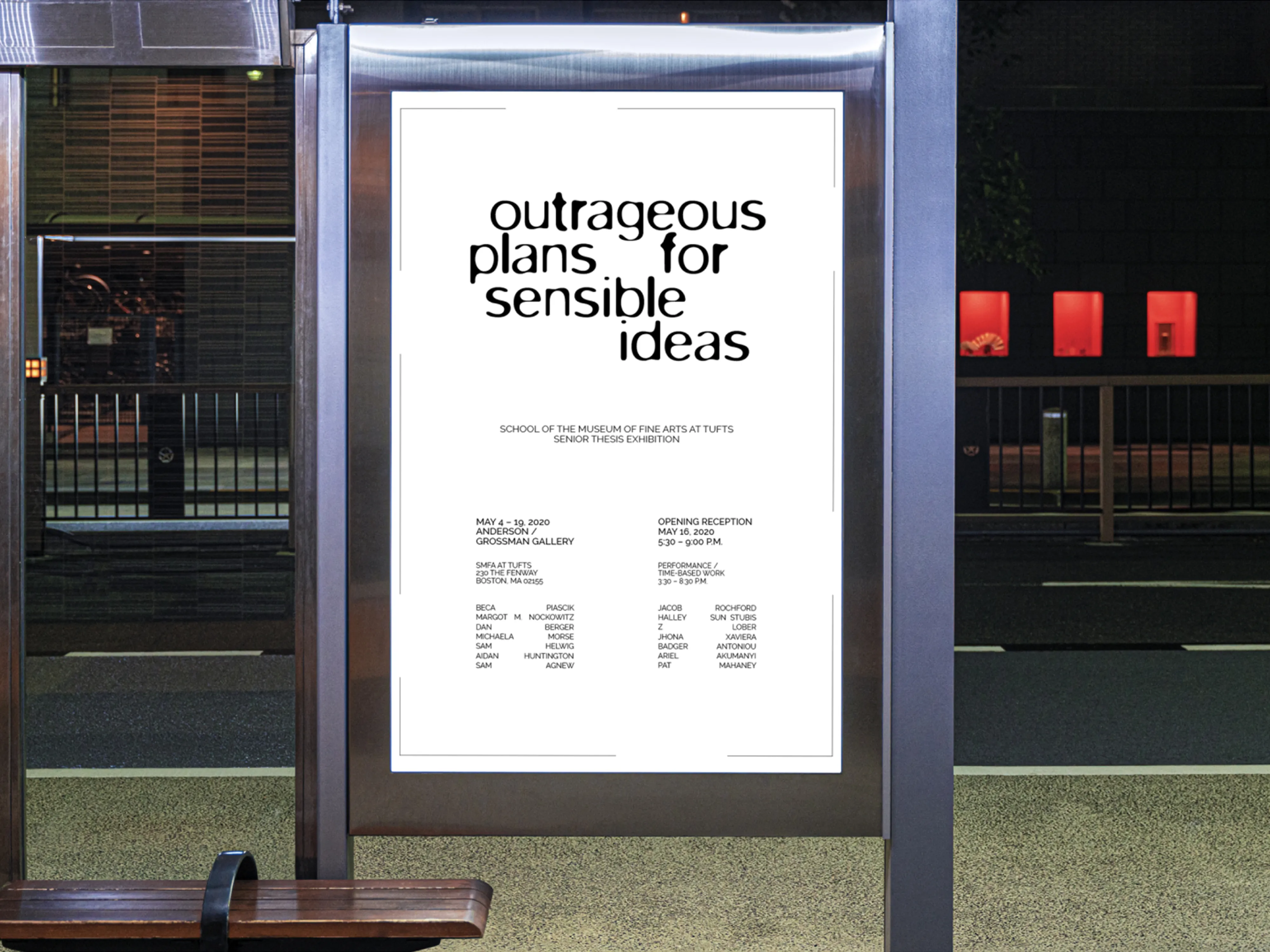
Senior Thesis exhibition catalogue and branding
Branding and vtuber design for a Twitch streamer
Branding and vtuber design for a Twitch streamer
If you’re curious about any of it,
reach out anytime.