The Stack Overflow rebrand.

Fifteen years in, with AI upending how developers work, Stack Overflow needed more than a refresh. We rebuilt it for where Stack was headed: verified knowledge that people and AI agents both build on.

Direction

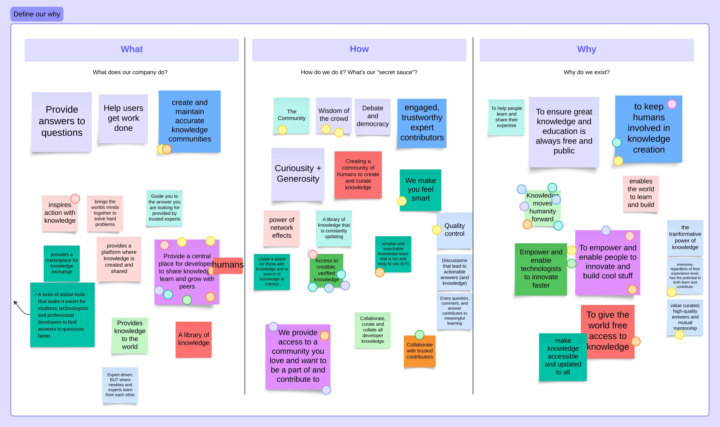
What began as a what-if in a sync with my boss, Dave, snowballed into three months of internal research, a 40-page RFP, and finally a four-agency bake-off that ended with Koto. Internal workshops mapped our what, how, and why long before Koto ever saw the brief, then weeks of work in London with their team expanded that into strategy and tone-of-voice sessions face to face with the C-suite. We left that week with every leader aligned on the same direction, months before any visual work began.

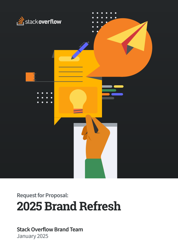
Cover of the 40-page RFP Jake and Dave drafted to kick off the rebrand search
A “What, How, Why” brand strategy board from an early remote workshop, covered in sticky notes
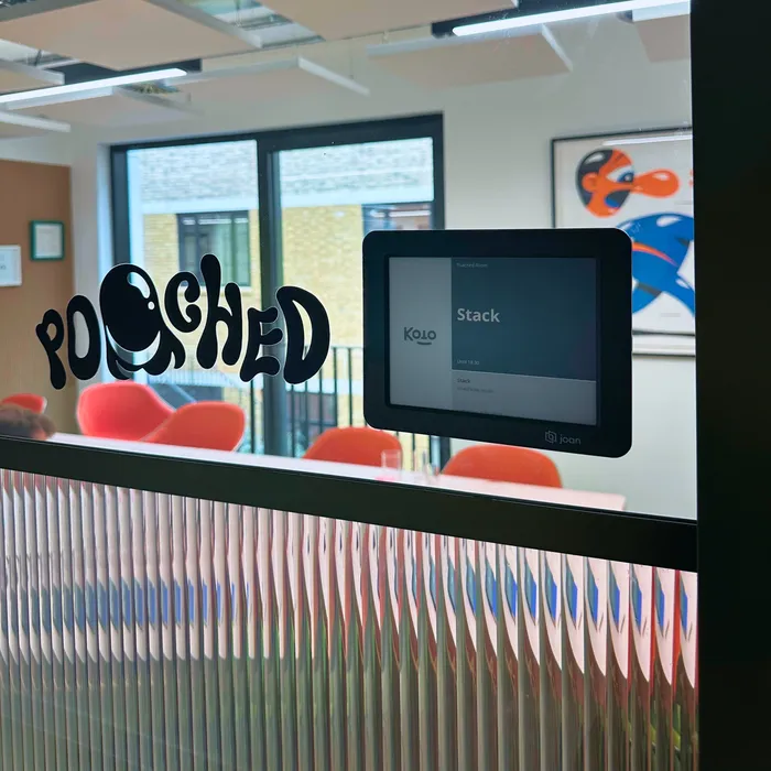
A room sign reading “Poached” next to a booking panel showing the room reserved for Stack Overflow, at Koto’s London studio
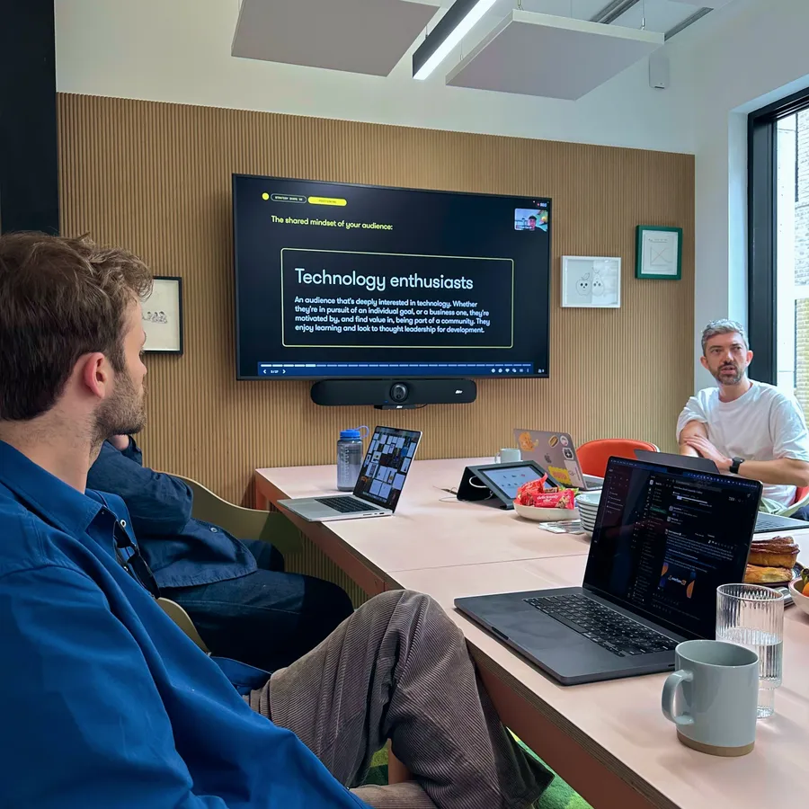
Jake and the Koto team in a meeting room, a slide reading “Technology enthusiasts” on the screen behind them
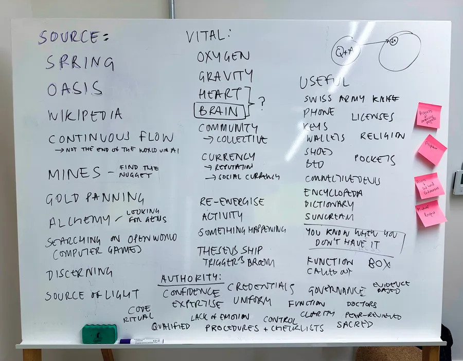
Whiteboard covered in handwritten notes from a brand metaphor exercise, listing words like “Source,” “Oasis,” and “Vital”
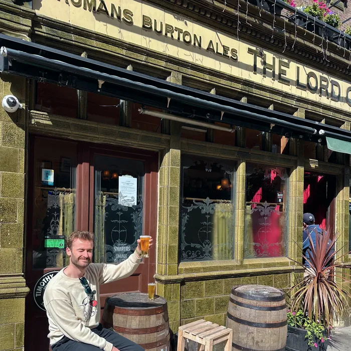
Jake raising a pint outside a London pub after the workshop
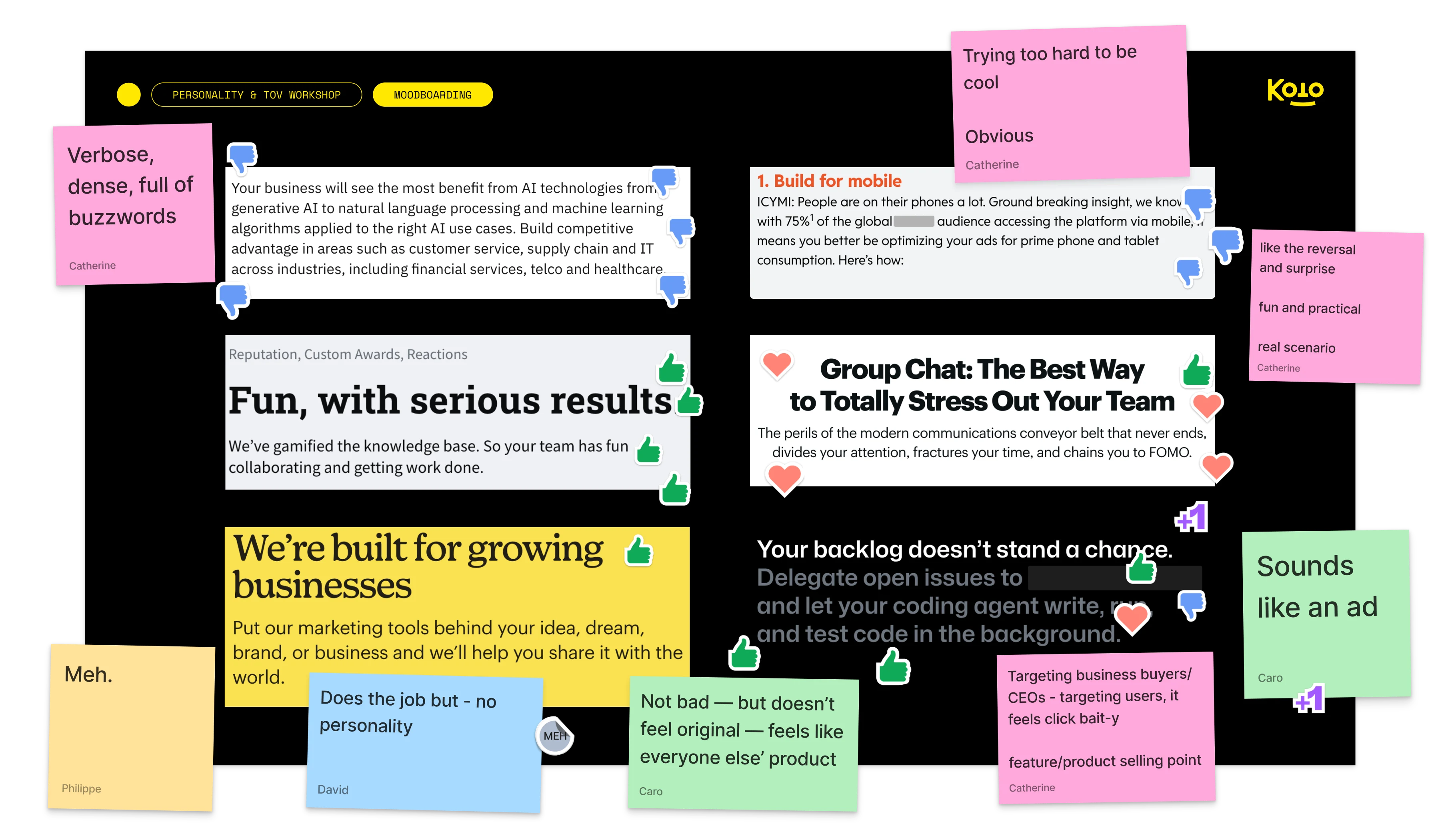
A personality and tone-of-voice workshop board, with sticky-note reactions to sample marketing copy

System

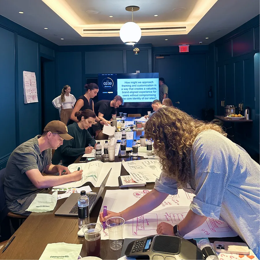
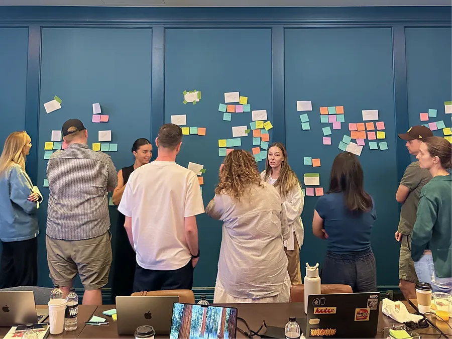
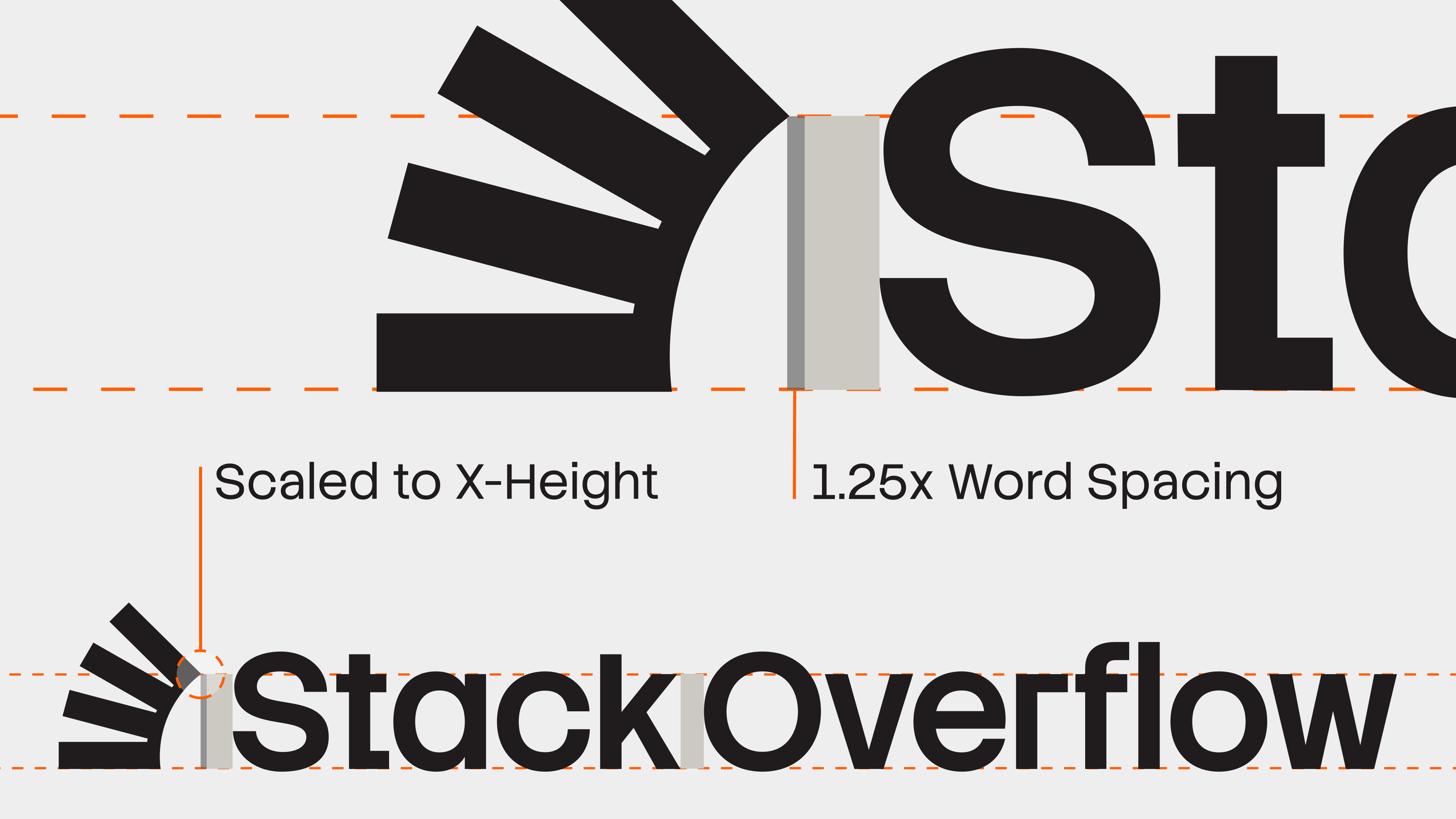
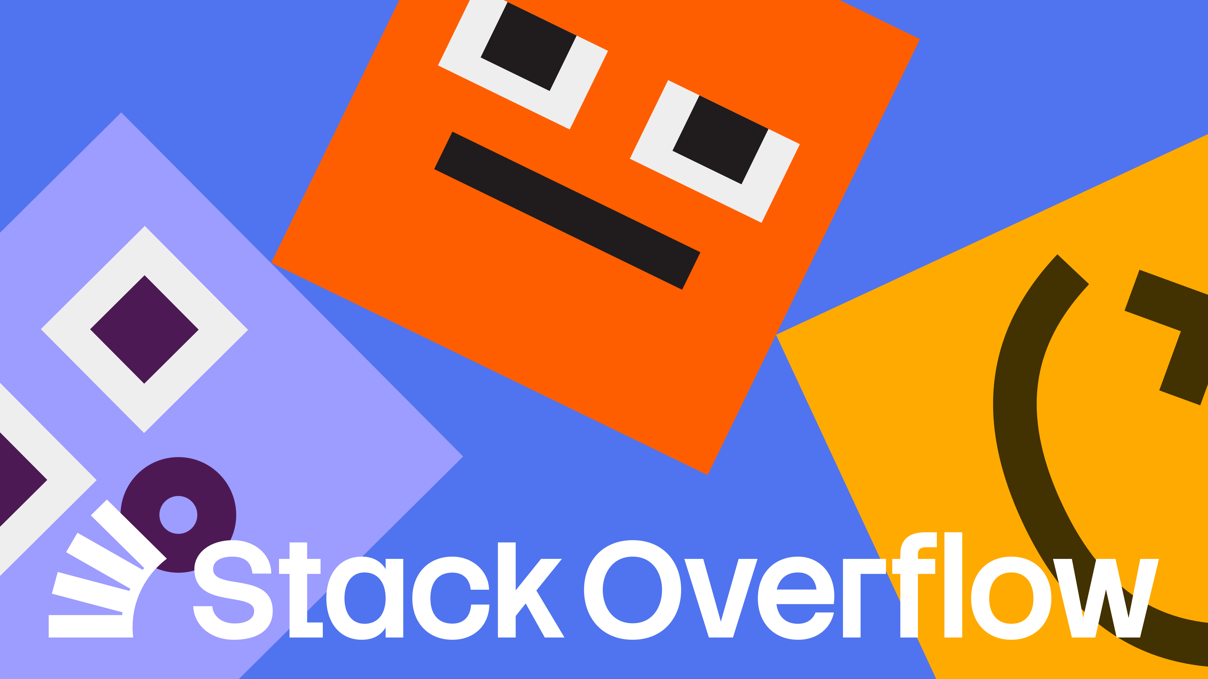
With the direction phase complete, we really got to work. Logo, type, a brand shape system, tone of voice, and more all came together on a guidelines site our team built end to end. We met with Koto and Stack Overflow’s product team in Nashville for a brand-product intensive, sticky notes covering the walls, as we stress-tested the new brand against real interface problems. We left Nashville with a system ready for rollout to both product and marketing.
2/0032

Ascender
Cap Height
x-Height
Baseline
Descender
2
00
An extreme close-up on the typeface, showing individual letterform details at large scale
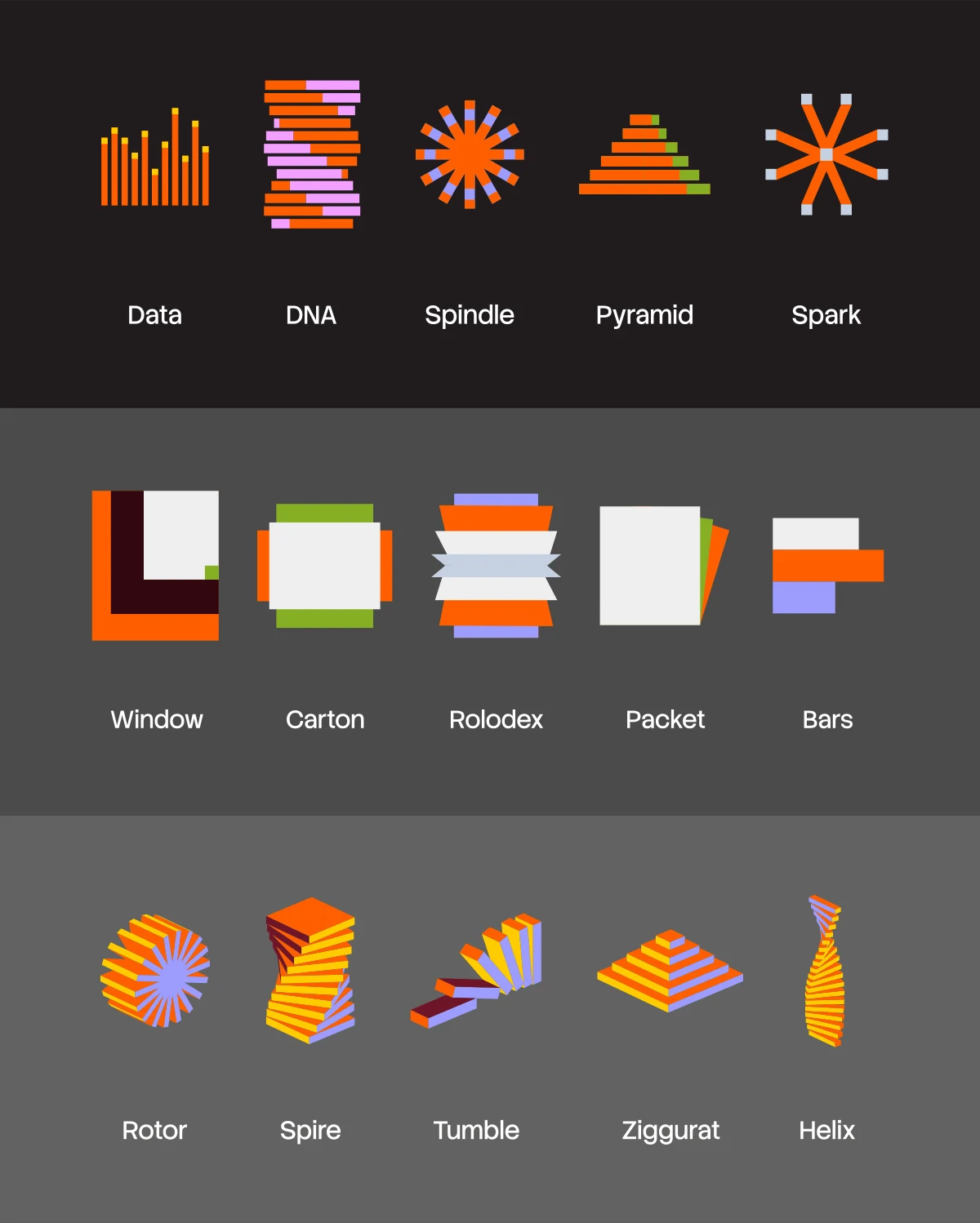
The full “Stacks” shape system — fifteen named 2D and 3D brand shapes, from Data and DNA to Rotor and Helix
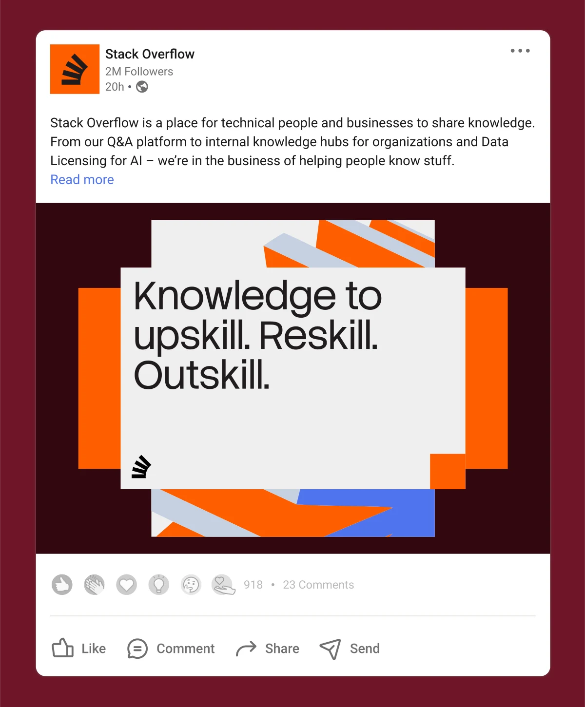
A mockup of a Stack Overflow LinkedIn post using the Stacks shape system
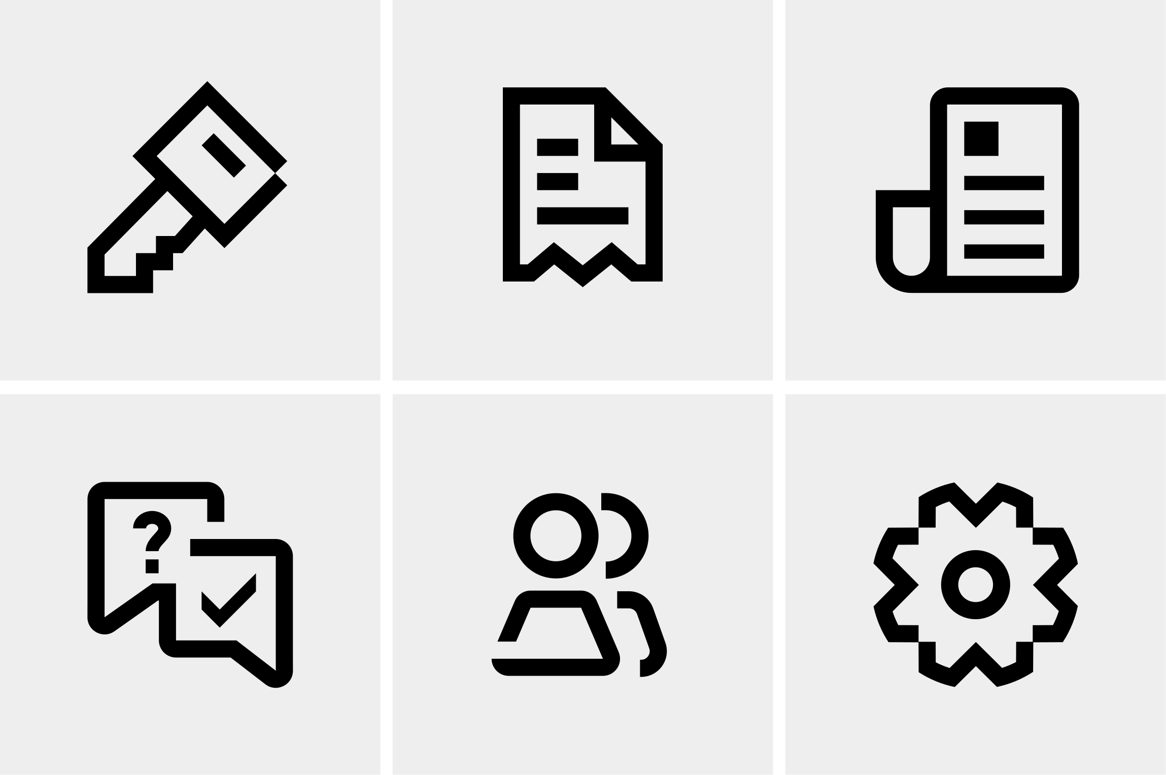
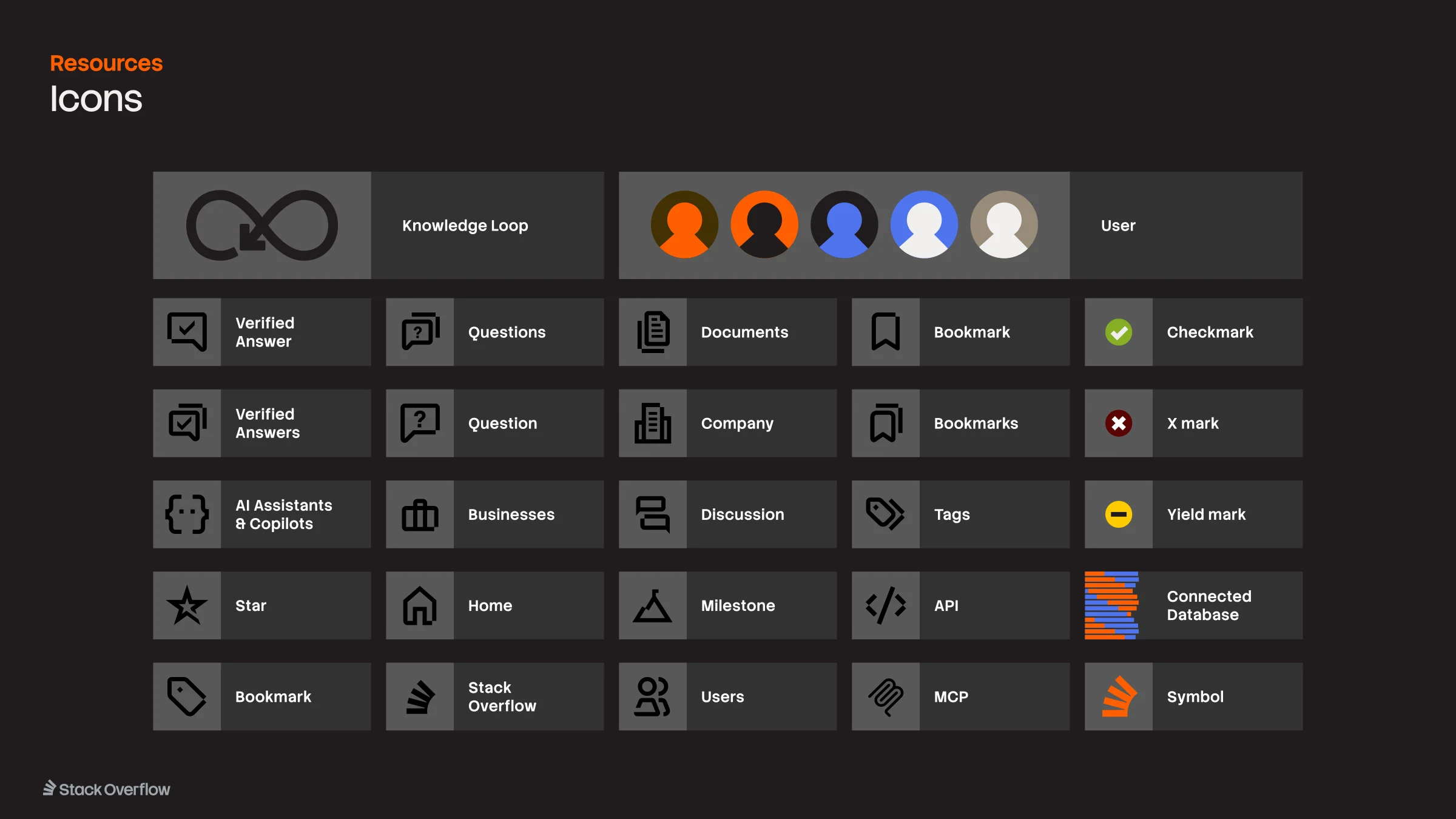
The new Stack Overflow icon library — a grid of outlined icons for access, billing, publishing, support, community, and settings
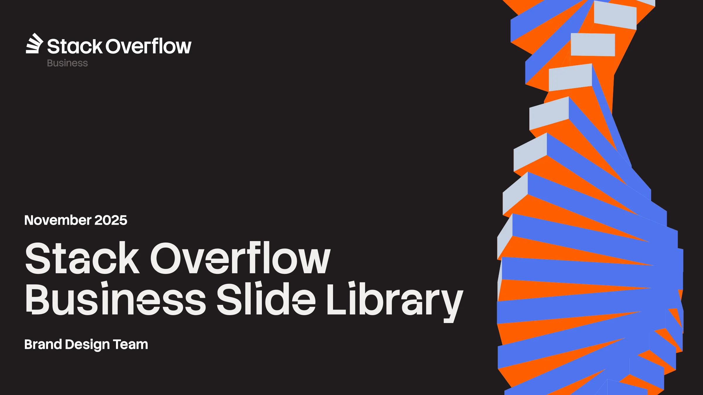
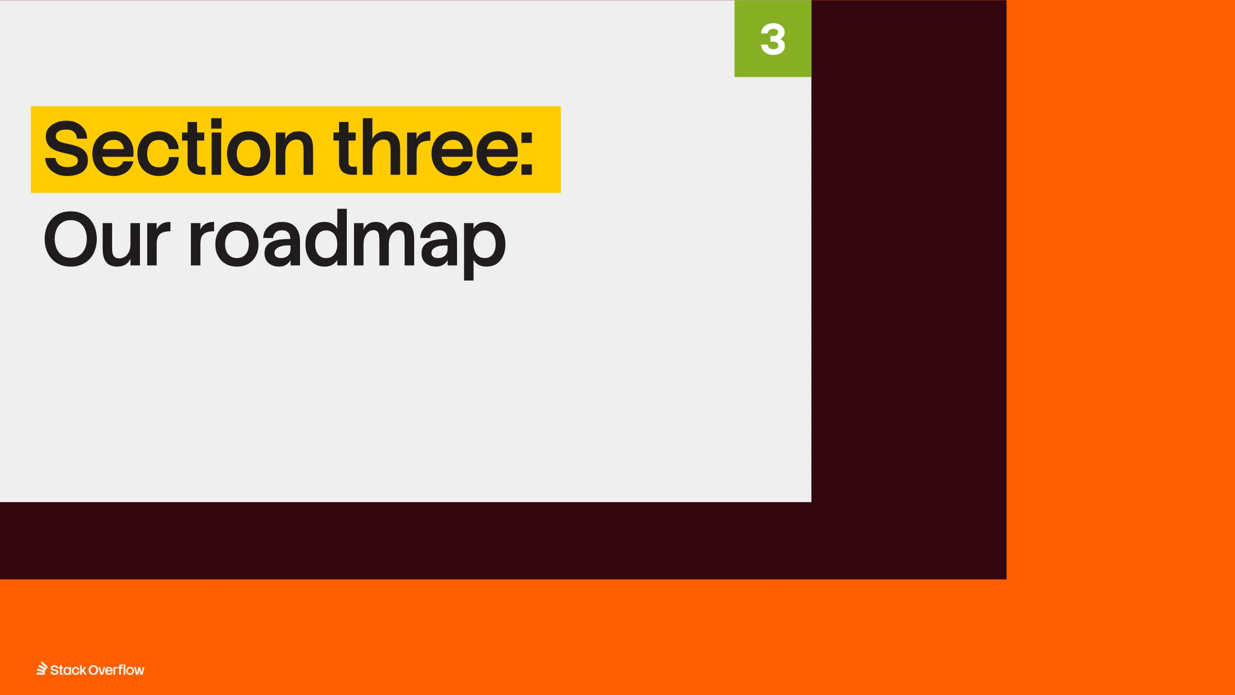
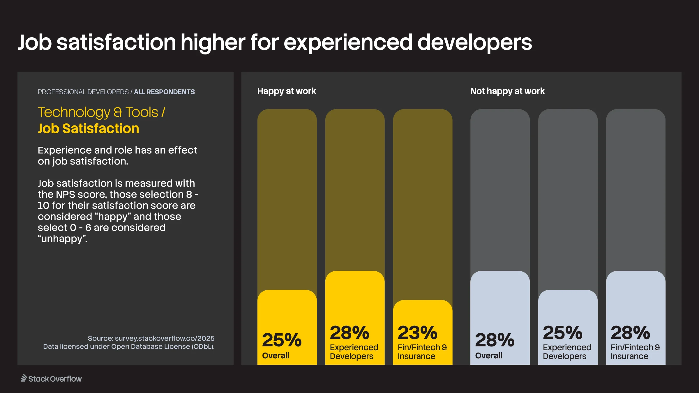
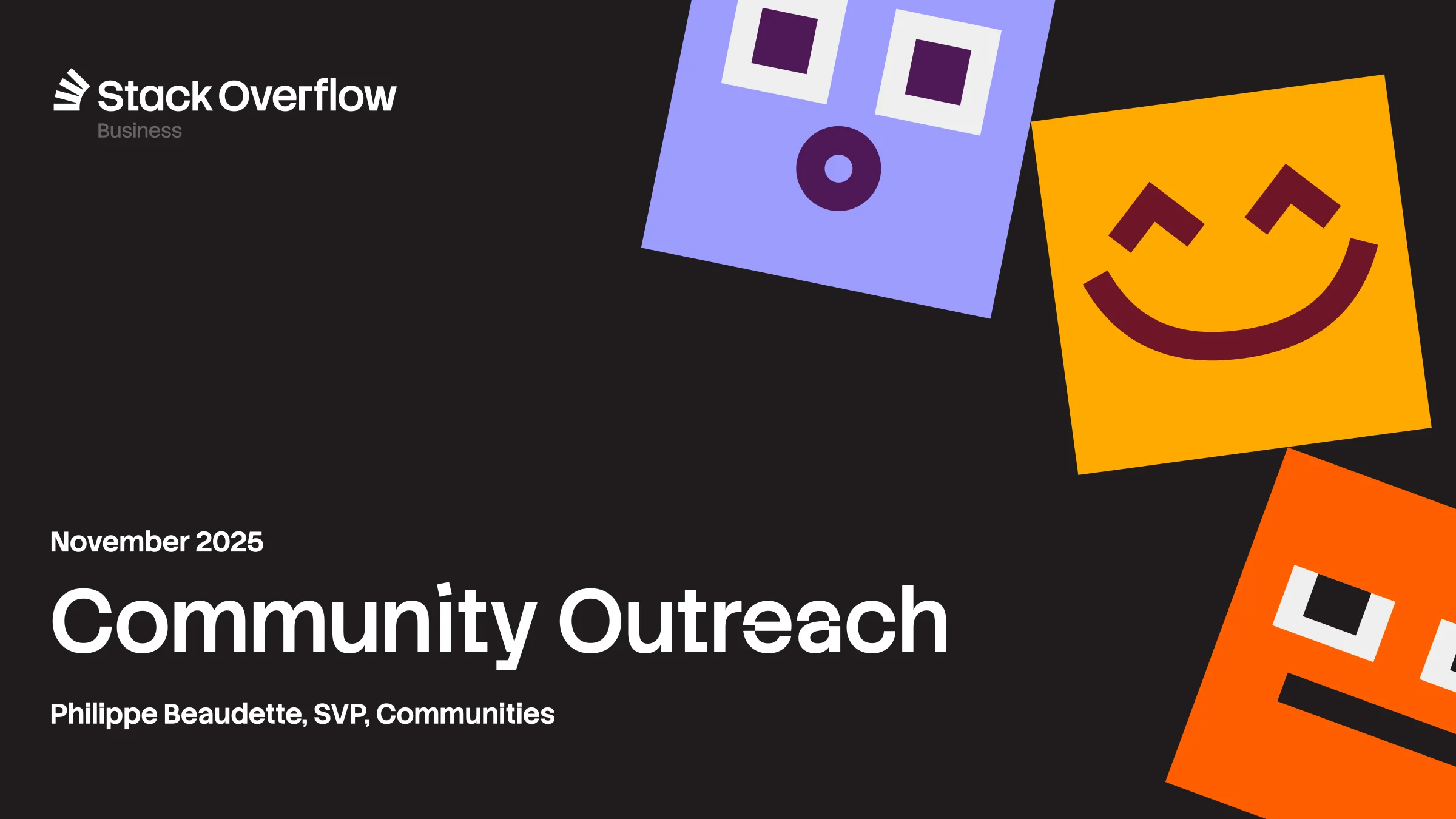
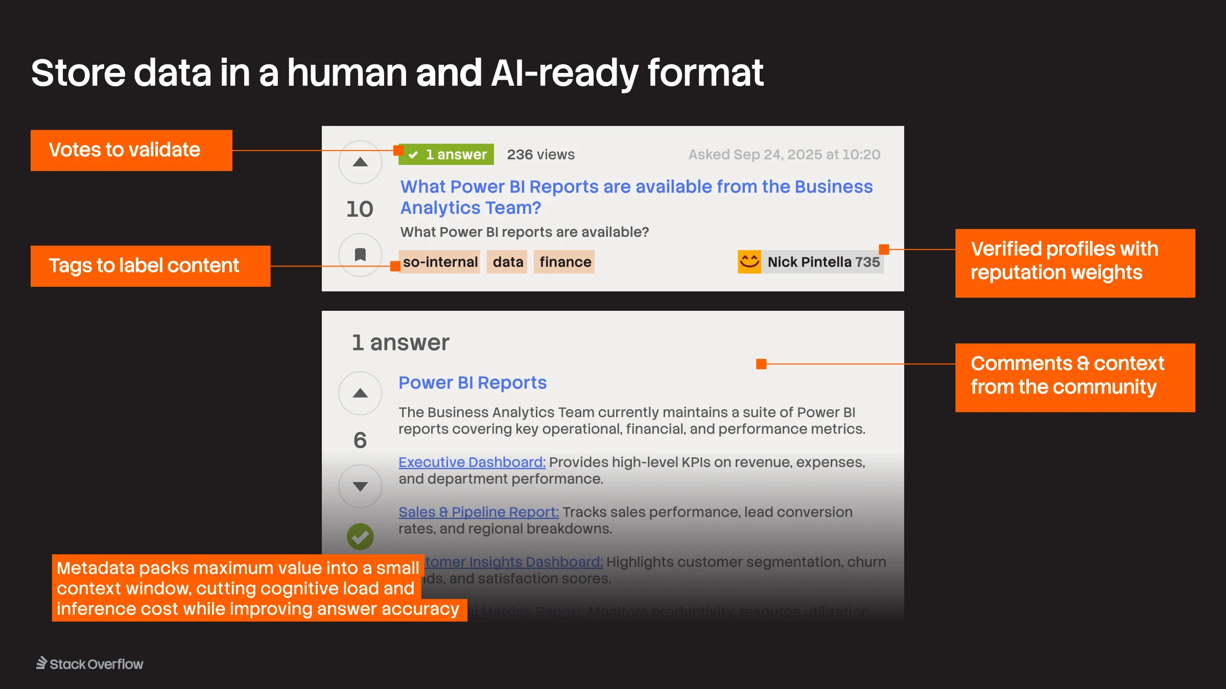
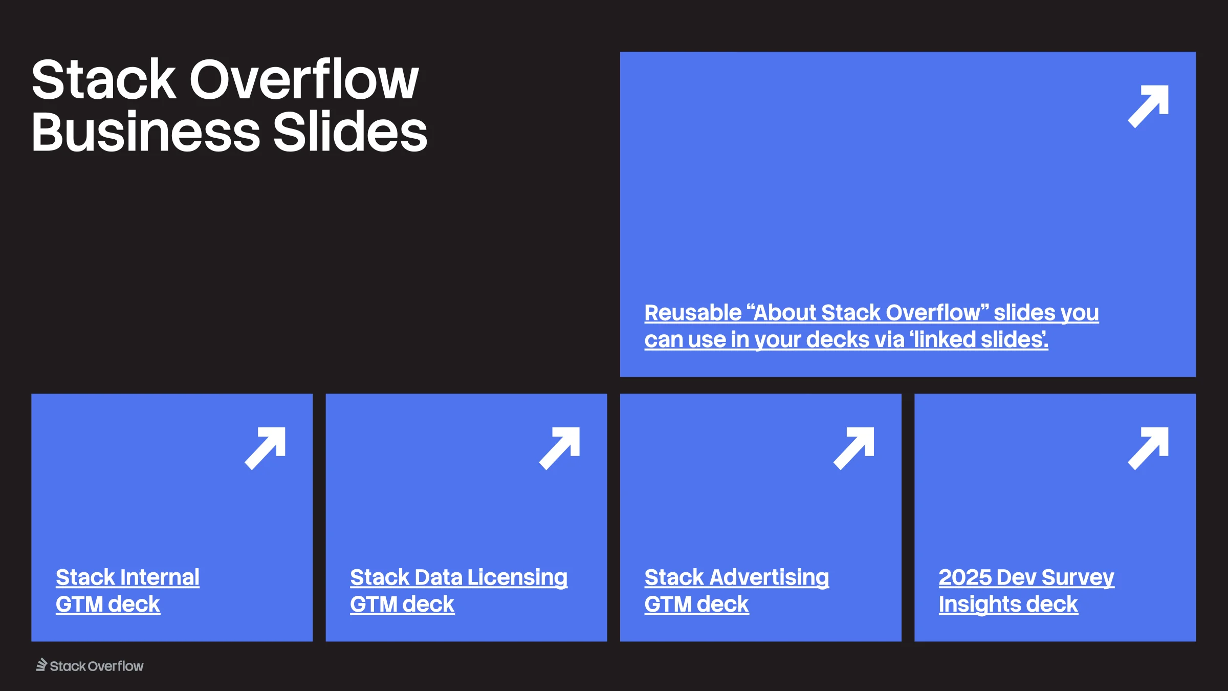
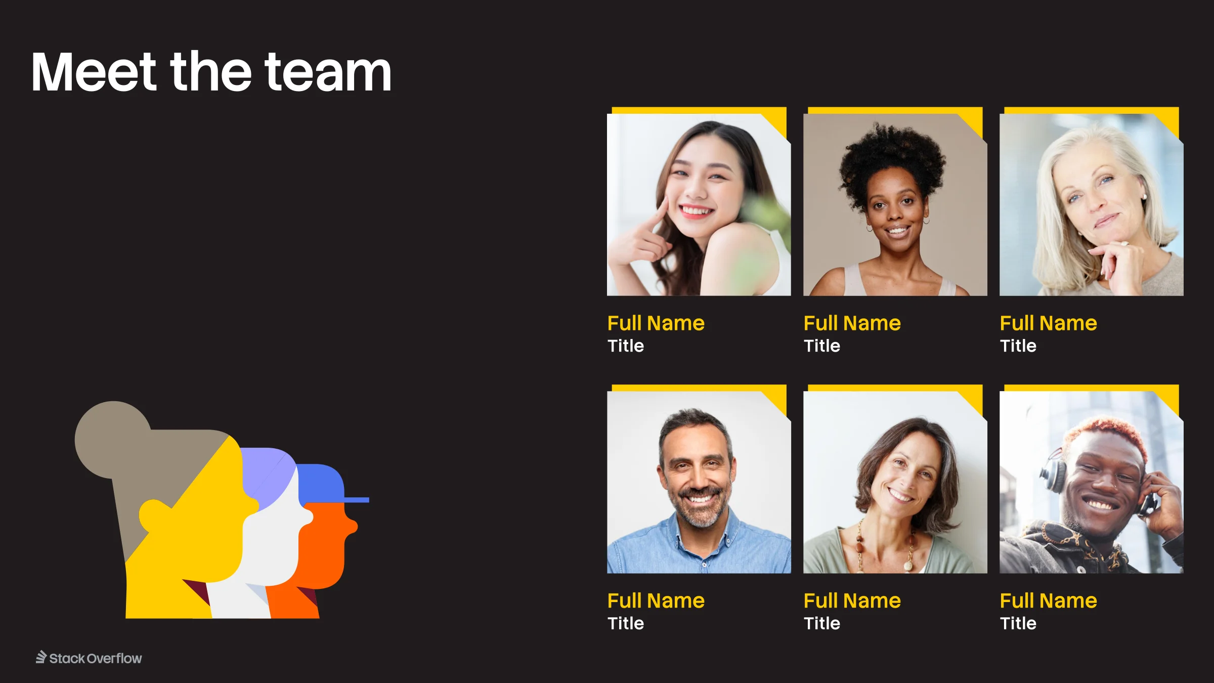
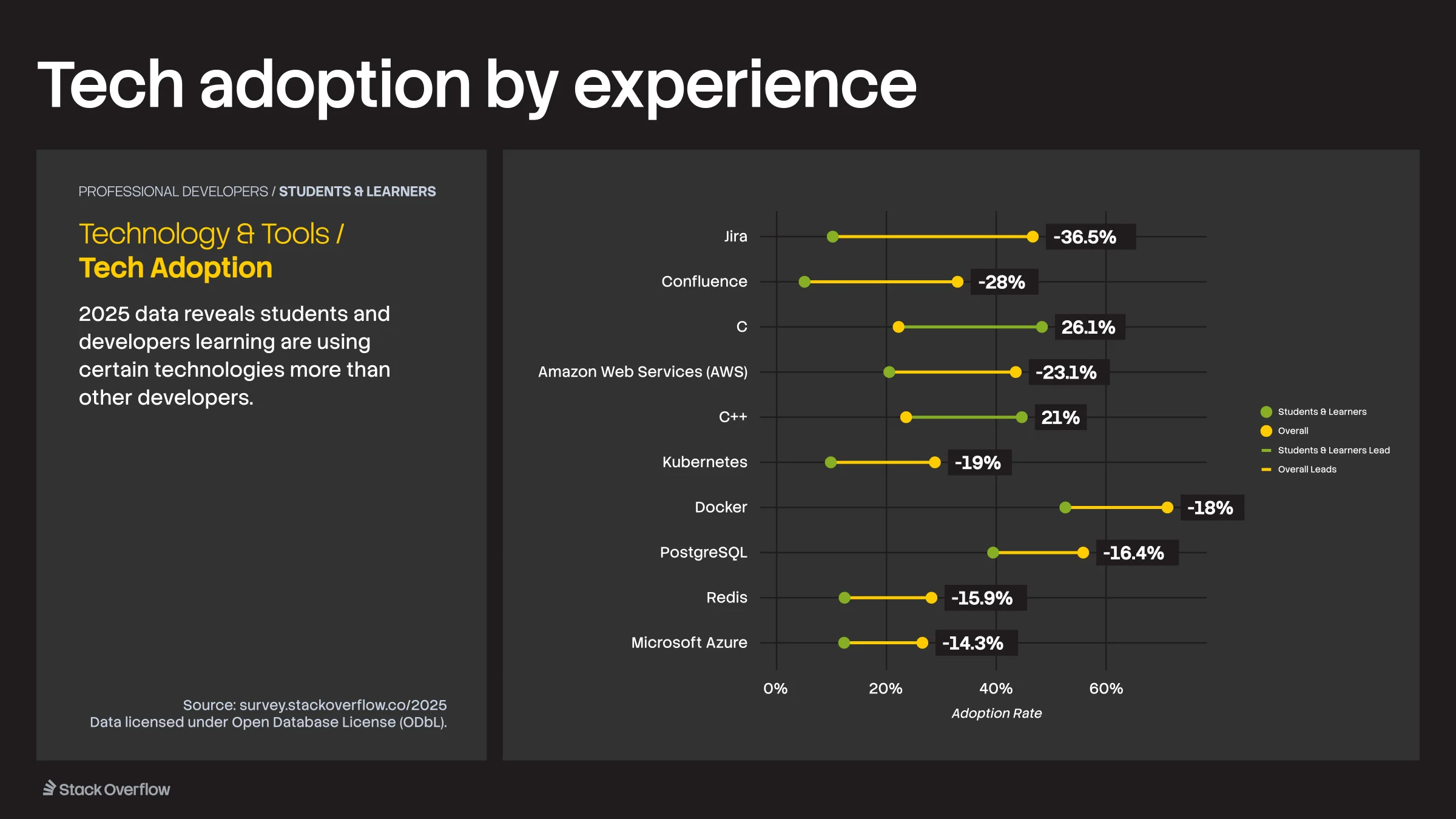
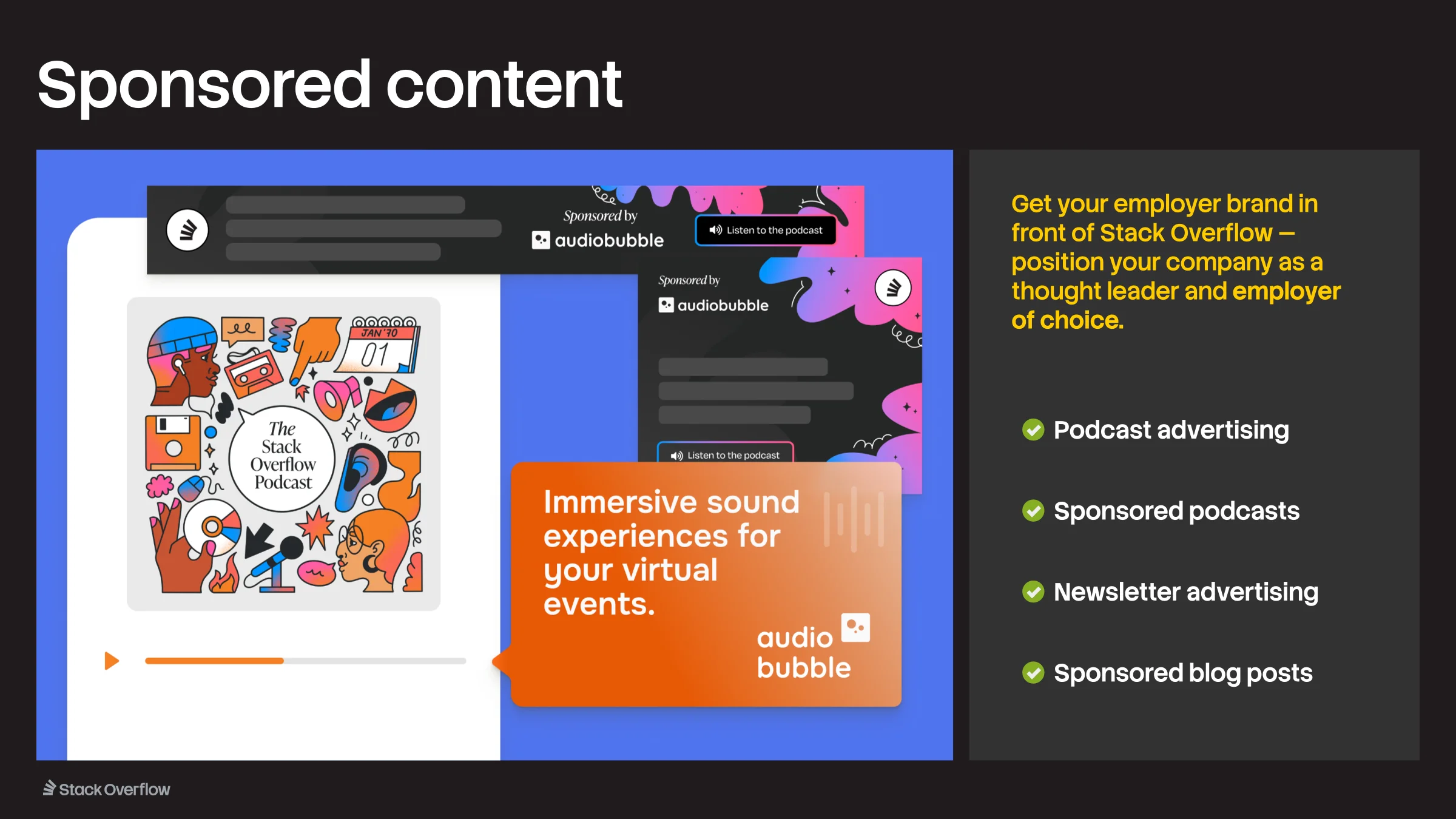
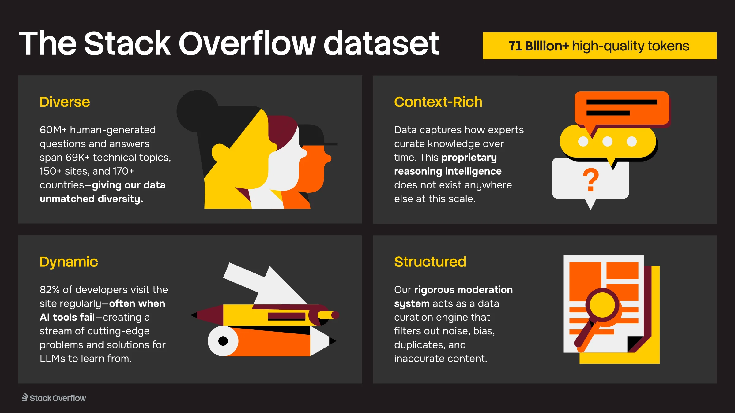
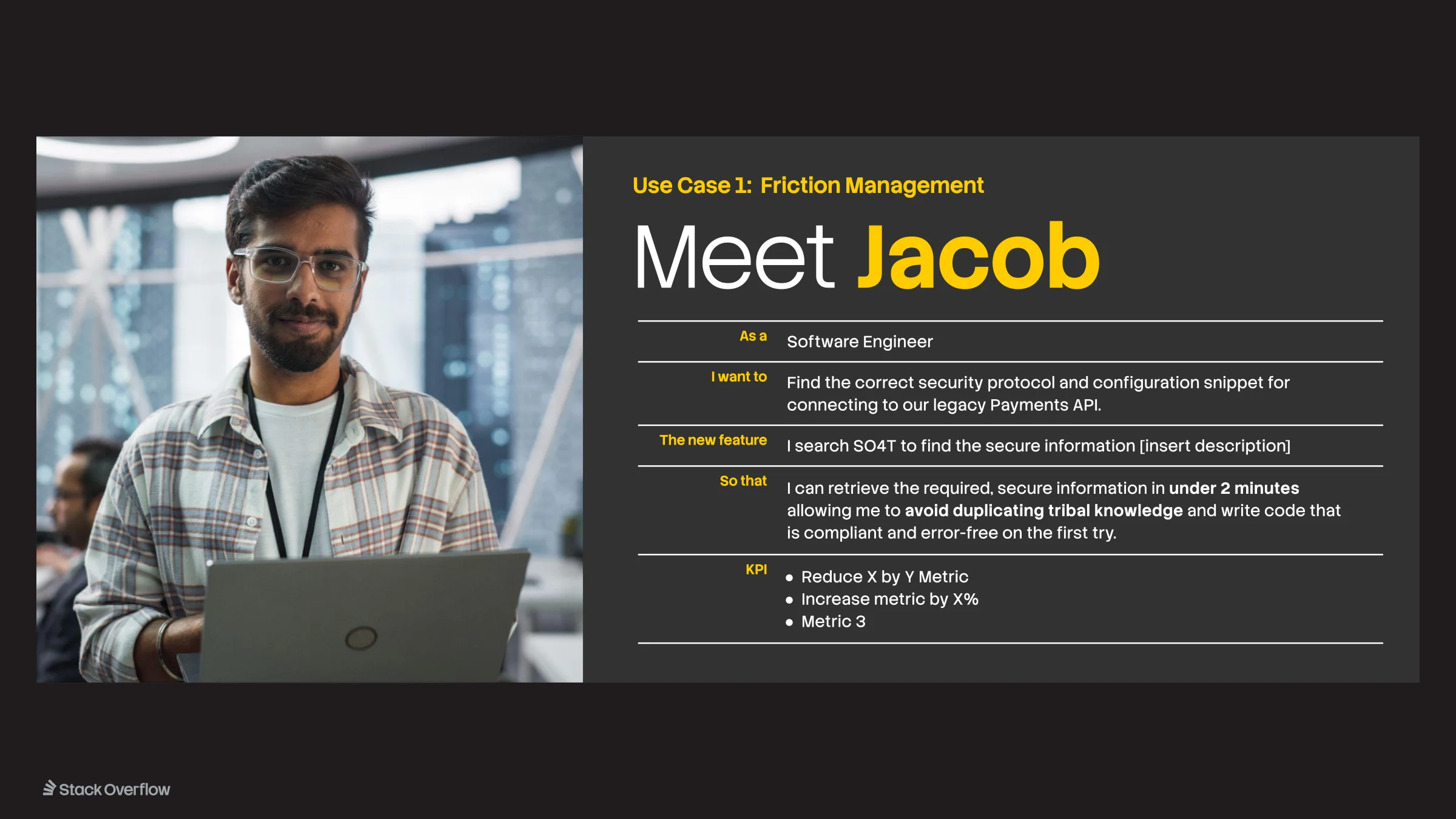
Slide from the Stack Overflow Business Template

01 / 20Stack Overflow Business Template

Koto and Stack Overflow working through product theming questions during a workshop in Nashville, sketches and sticky notes covering the table
The Koto and Stack Overflow teams grouped around a wall of sticky notes from the Nashville workshop
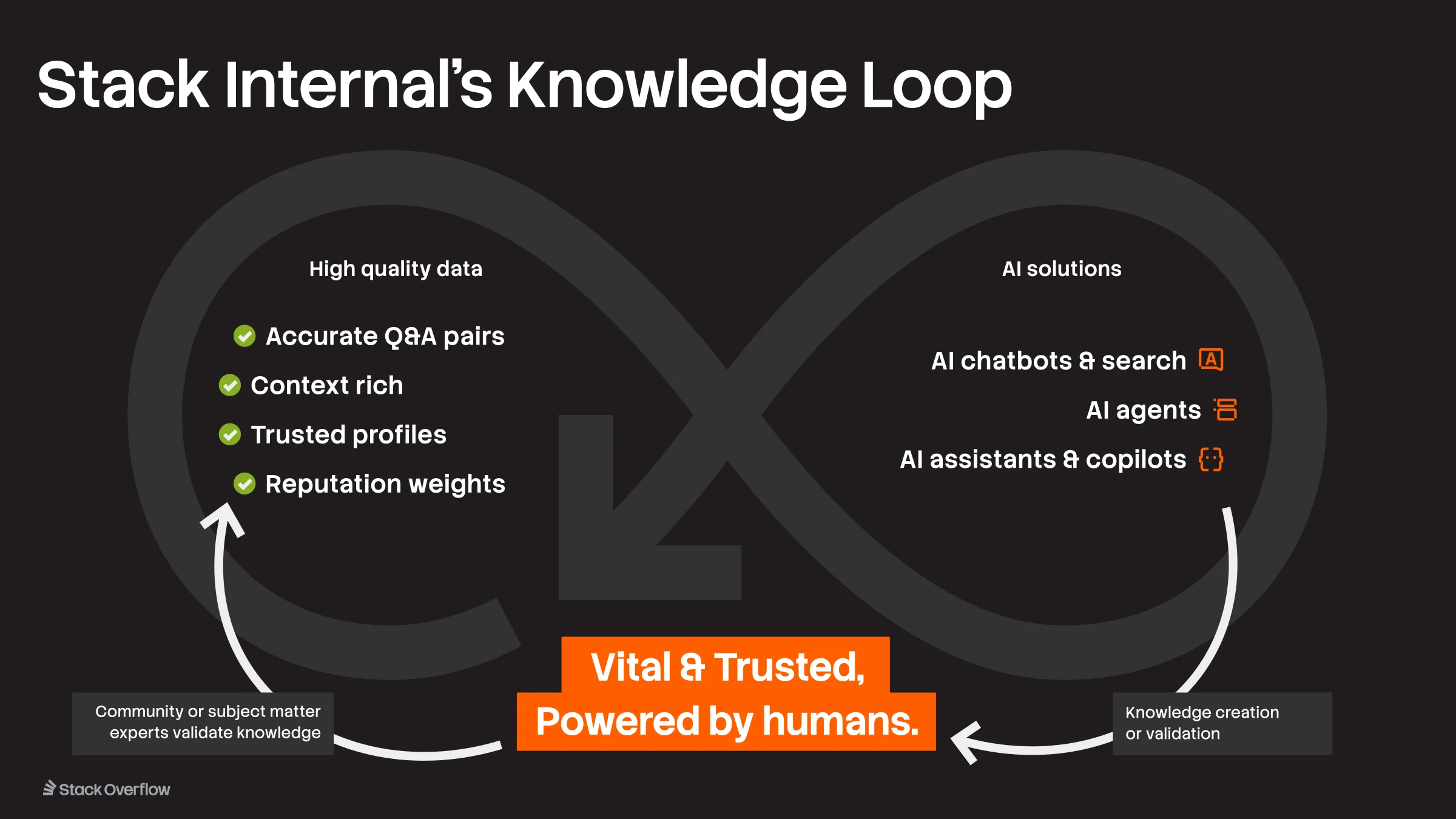
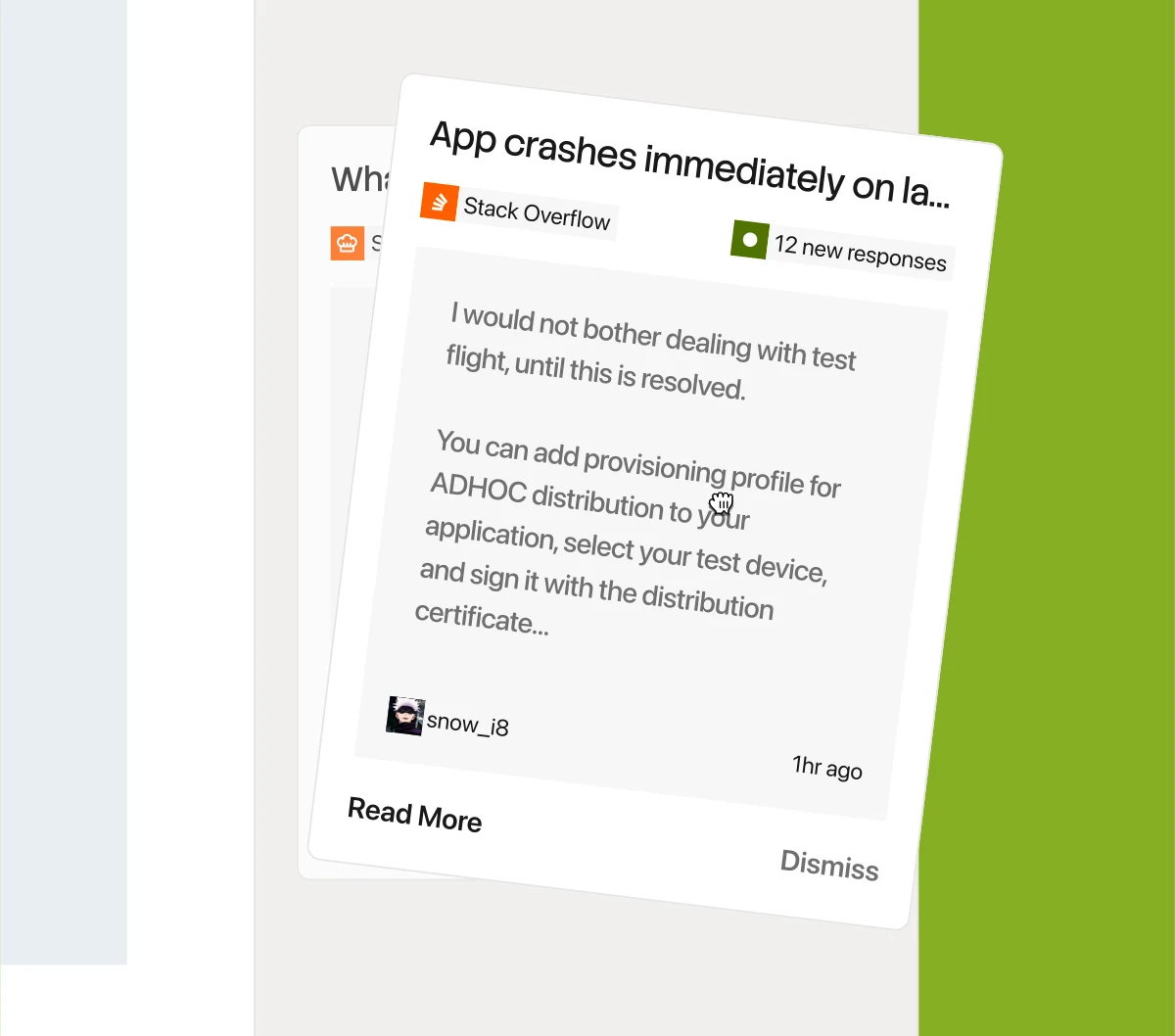
Stacked push-notification cards showing the rebrand carrying into a new product-alert design
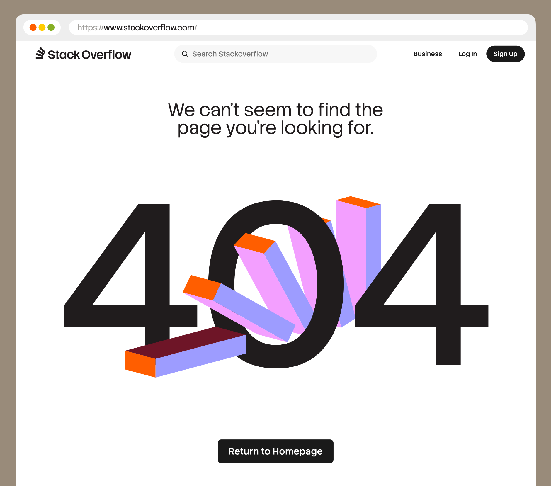
A 404 error page using the rebrand’s 3D isometric shapes

Rollout

Then it had to ship. Over the next year the brand reached everything we touched: the launch of Stack Internal, booths from Ai4 to Microsoft Ignite, our podcasts, the Developer Survey, and every one of our Figma files, finally organized. Inside the company, the refreshed vision and mission gave Stack a clearer sense of itself, and put it in step with where the product is headed.

Sixteen Figma file covers built on the rebrand’s cover template, one per project — events, launches, the podcast, the developer survey, swag, and more
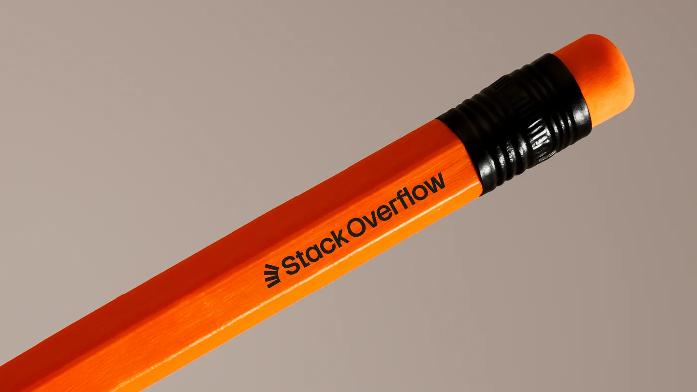
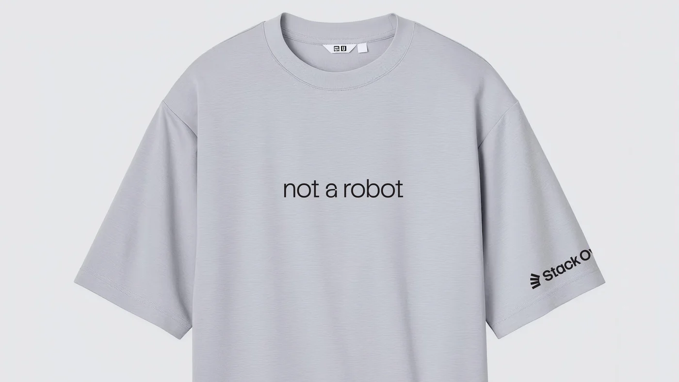
An orange Stack Overflow pencilA grey t-shirt reading “not a robot,” with the Stack Overflow logo on the sleeve
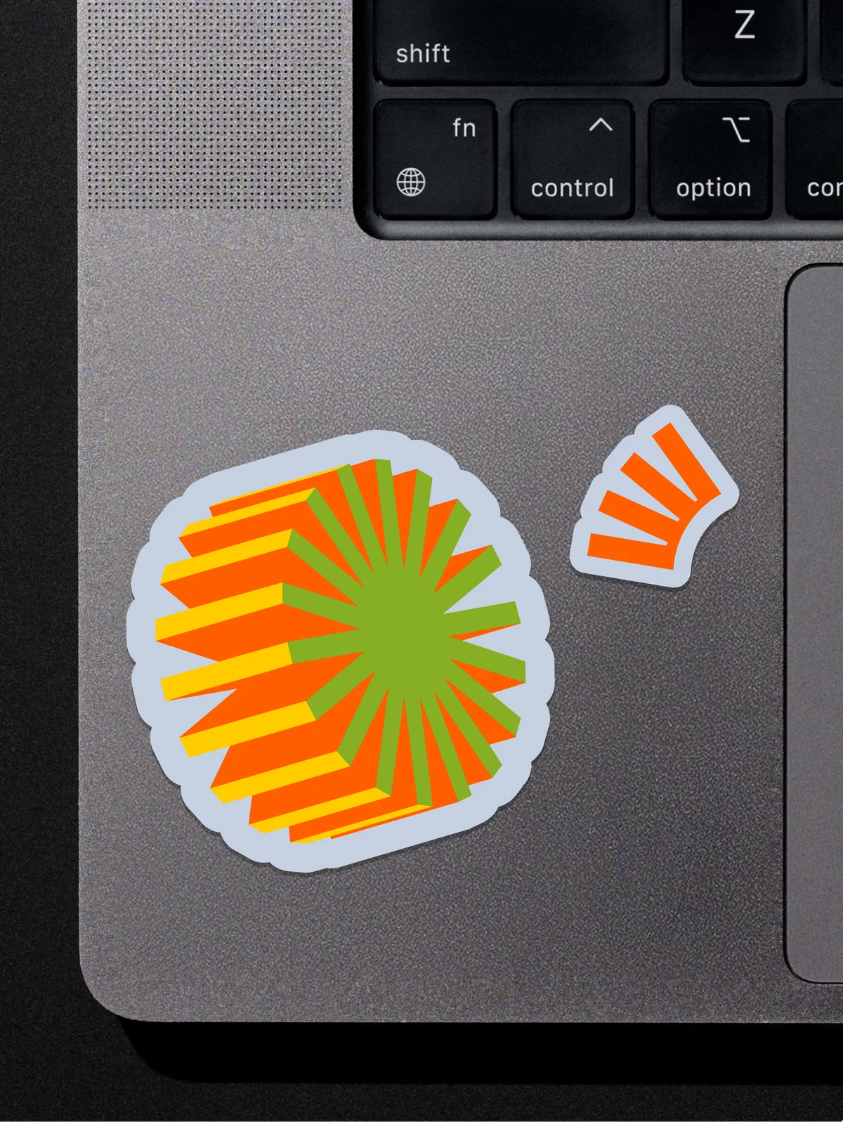
Stack Overflow brand-shape stickers on a laptop, beside the keyboard

With Dave Longworth (Senior Director, Design), Koto (brand agency), and Stack Overflow’s product and marketing teams.